Toggle sidebar
Components
Accordion
Autocomplete
Avatar
Badge
Brand
Button
Breadcrumbs
Calendar
Callout
Card
Carousel
Chart
Checkbox
Color picker
Command
Context
Composer
Date picker
Dropdown
Editor
Field
File upload
Heading
Icon
Input
Kanban
Modal
Navbar
OTP Input
Pagination
Pillbox
Popover
Profile
Progress
Radio
Select
Separator
Skeleton
Slider
Switch
Table
Tabs
Text
Textarea
Time picker
Timeline
Toast
Tooltip
New
New
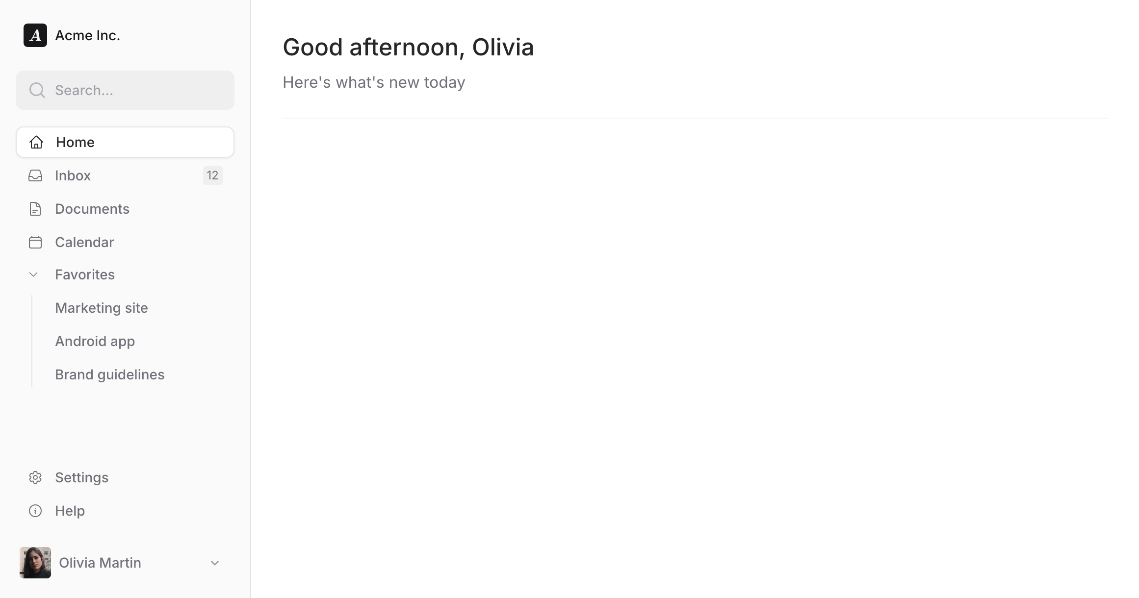
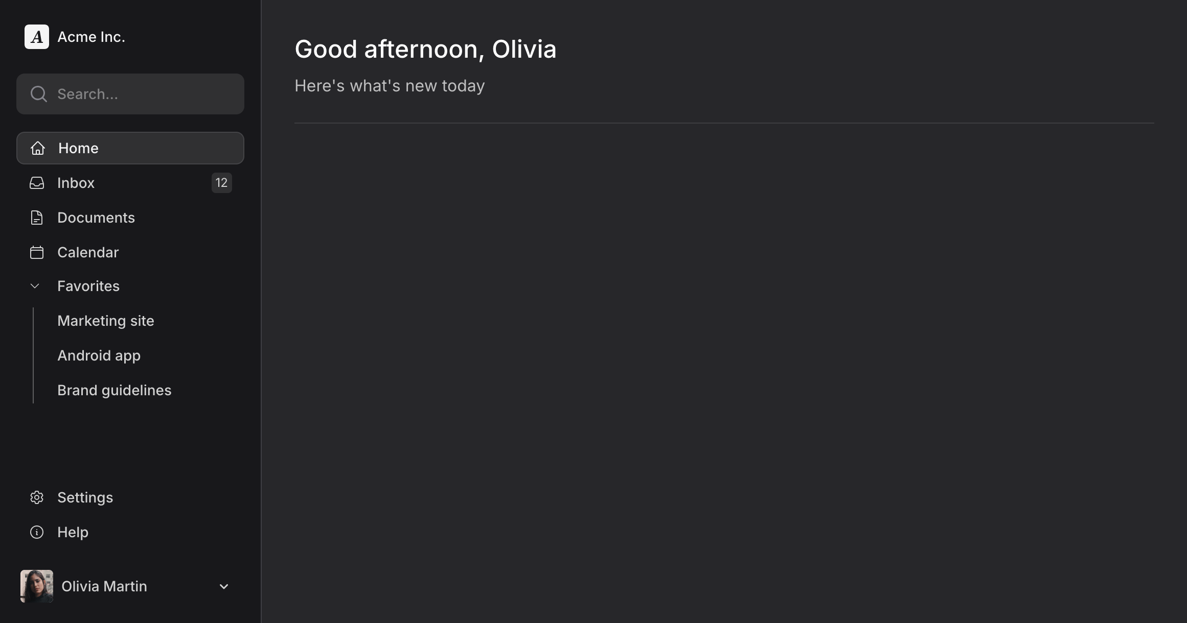
Sidebar
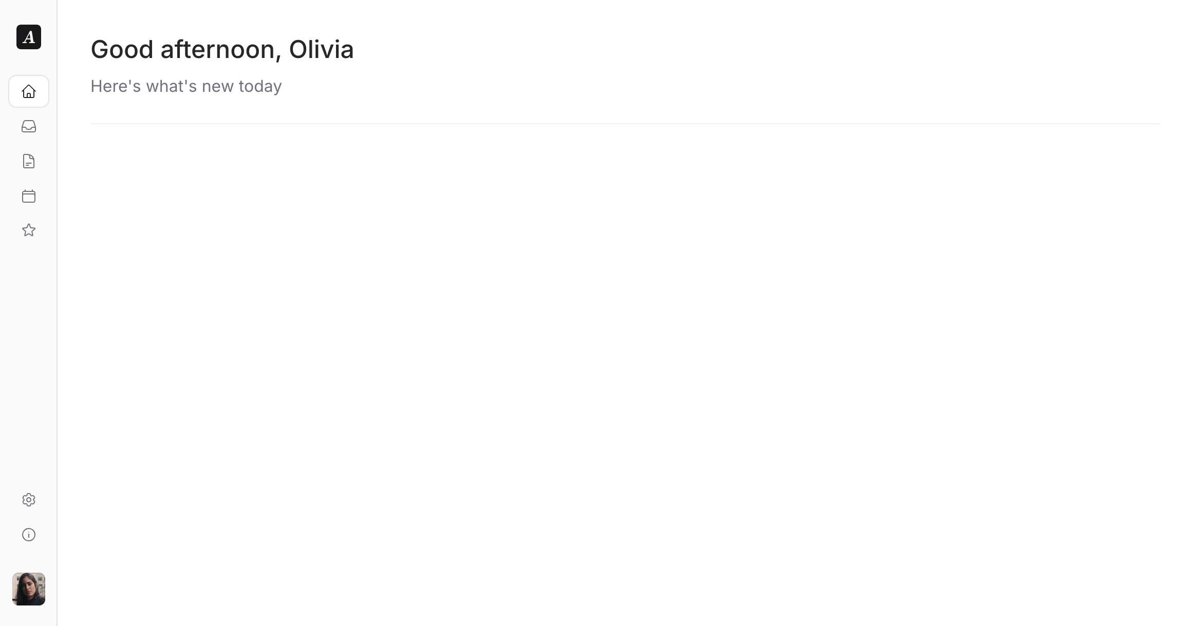
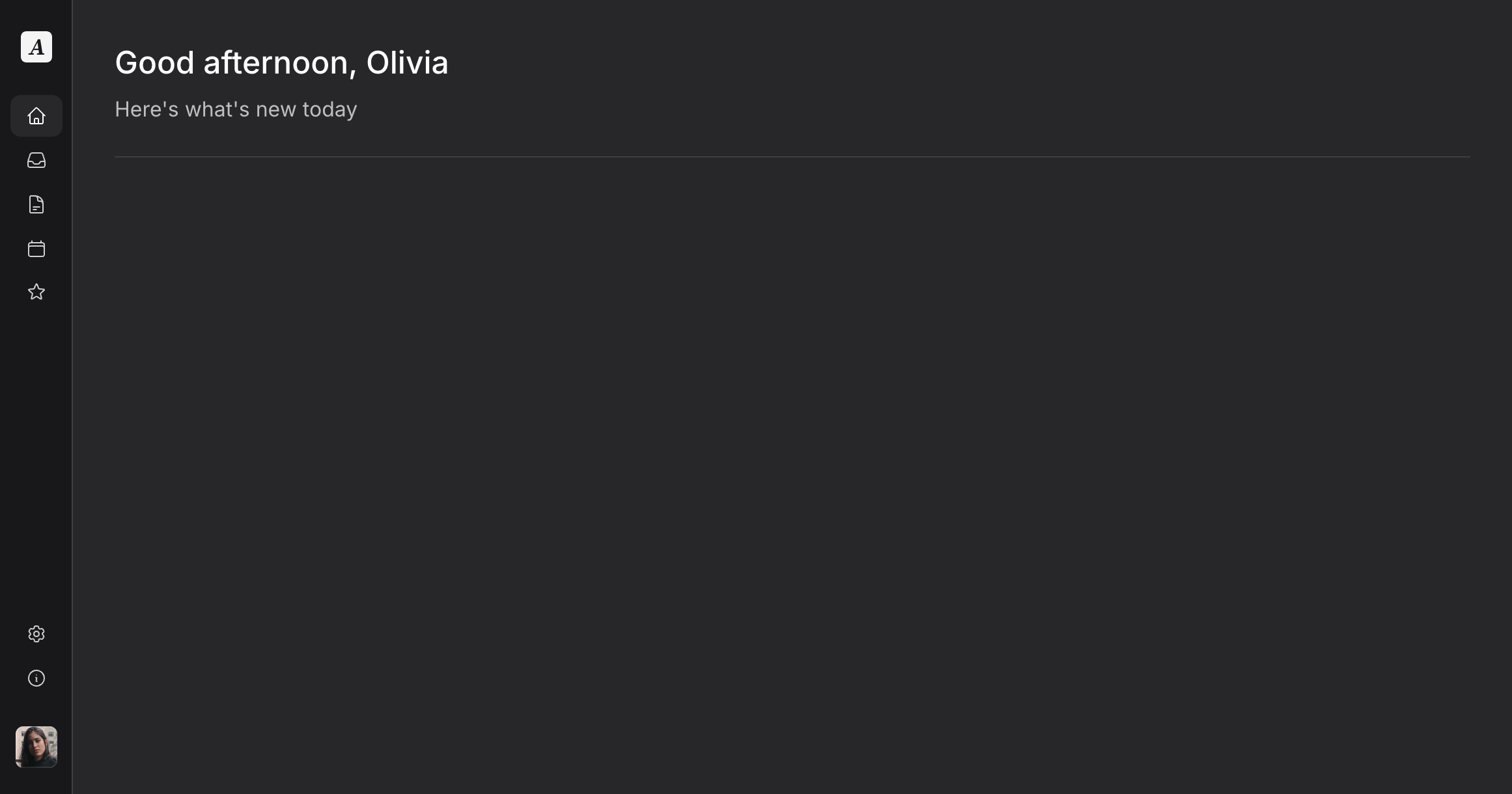
Use a sidebar navigation layout to keep your application content front and center.
Copy to clipboard
<head> <!-- ... --> @fluxAppearance</head><body class="min-h-screen bg-white dark:bg-zinc-800 antialiased"> <flux:sidebar sticky collapsible="mobile" class="bg-zinc-50 dark:bg-zinc-900 border-r border-zinc-200 dark:border-zinc-700"> <flux:sidebar.header> <flux:sidebar.brand href="#" logo="https://fluxui.dev/img/demo/logo.png" logo:dark="https://fluxui.dev/img/demo/dark-mode-logo.png" name="Acme Inc." /> <flux:sidebar.collapse class="lg:hidden" /> </flux:sidebar.header> <flux:sidebar.search placeholder="Search..." /> <flux:sidebar.nav> <flux:sidebar.item icon="home" href="#" current>Home</flux:sidebar.item> <flux:sidebar.item icon="inbox" badge="12" href="#">Inbox</flux:sidebar.item> <flux:sidebar.item icon="document-text" href="#">Documents</flux:sidebar.item> <flux:sidebar.item icon="calendar" href="#">Calendar</flux:sidebar.item> <flux:sidebar.group expandable heading="Favorites" class="grid"> <flux:sidebar.item href="#">Marketing site</flux:sidebar.item> <flux:sidebar.item href="#">Android app</flux:sidebar.item> <flux:sidebar.item href="#">Brand guidelines</flux:sidebar.item> </flux:sidebar.group> </flux:sidebar.nav> <flux:sidebar.spacer /> <flux:sidebar.nav> <flux:sidebar.item icon="cog-6-tooth" href="#">Settings</flux:sidebar.item> <flux:sidebar.item icon="information-circle" href="#">Help</flux:sidebar.item> </flux:sidebar.nav> <flux:dropdown position="top" align="start" class="max-lg:hidden"> <flux:sidebar.profile avatar="https://fluxui.dev/img/demo/user.png" name="Olivia Martin" /> <flux:menu> <flux:menu.radio.group> <flux:menu.radio checked>Olivia Martin</flux:menu.radio> <flux:menu.radio>Truly Delta</flux:menu.radio> </flux:menu.radio.group> <flux:menu.separator /> <flux:menu.item icon="arrow-right-start-on-rectangle">Logout</flux:menu.item> </flux:menu> </flux:dropdown> </flux:sidebar> <flux:header class="lg:hidden"> <flux:sidebar.toggle class="lg:hidden" icon="bars-2" inset="left" /> <flux:spacer /> <flux:dropdown position="top" alignt="start"> <flux:profile avatar="https://fluxui.dev/img/demo/user.png" /> <flux:menu> <flux:menu.radio.group> <flux:menu.radio checked>Olivia Martin</flux:menu.radio> <flux:menu.radio>Truly Delta</flux:menu.radio> </flux:menu.radio.group> <flux:menu.separator /> <flux:menu.item icon="arrow-right-start-on-rectangle">Logout</flux:menu.item> </flux:menu> </flux:dropdown> </flux:header> <flux:main> <flux:heading size="xl" level="1">Good afternoon, Olivia</flux:heading> <flux:text class="mb-6 mt-2 text-base">Here's what's new today</flux:text> <flux:separator variant="subtle" /> </flux:main> @fluxScripts</body>Secondary header
Use a top header for secondary navigation.
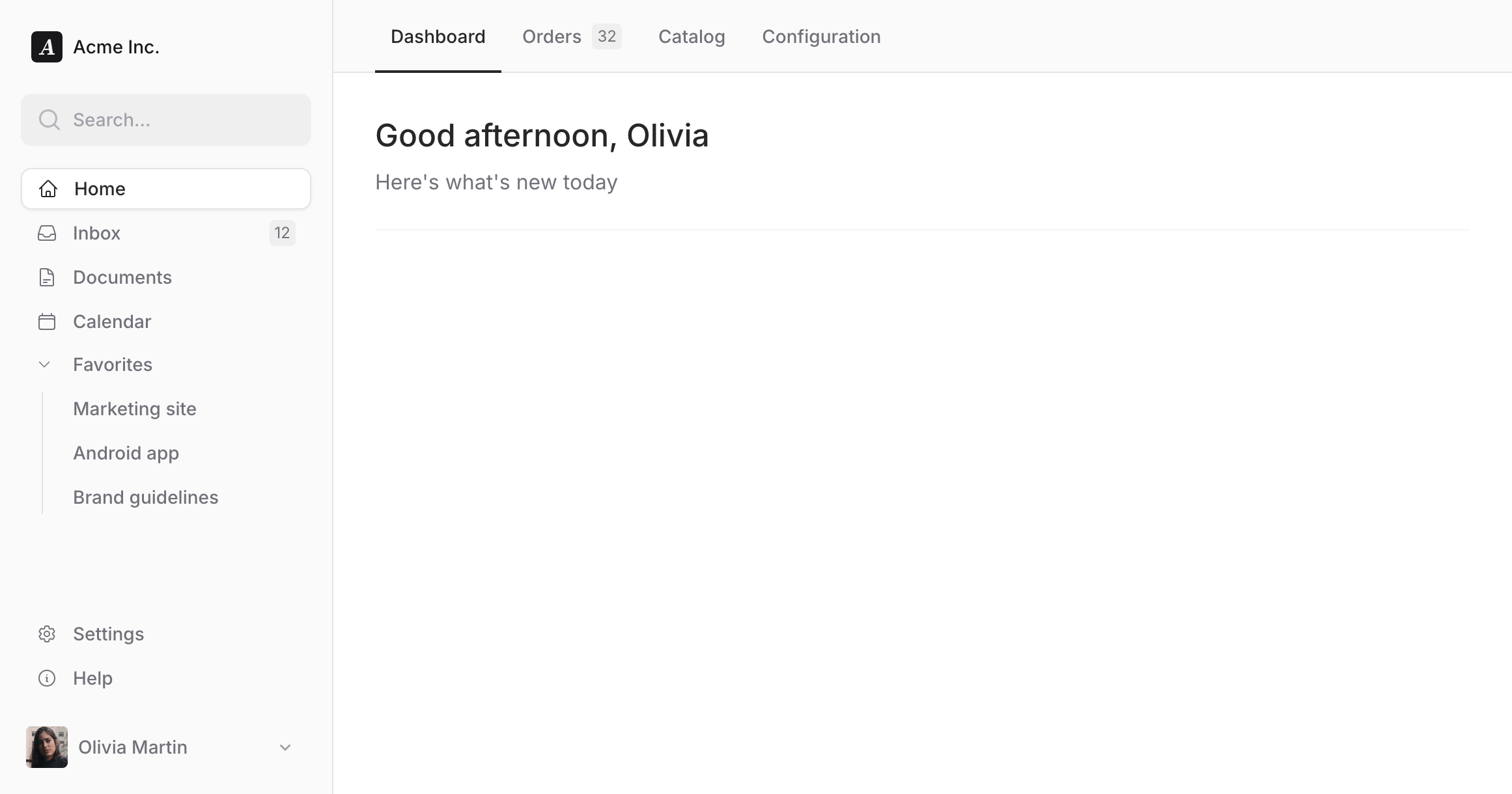
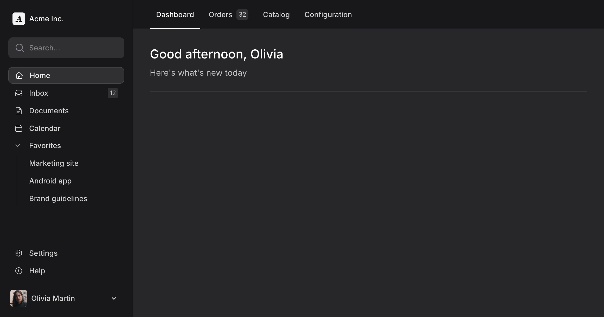
Copy to clipboard
<head> <!-- ... --> @fluxAppearance</head><body class="min-h-screen bg-white dark:bg-zinc-800 antialiased"> <flux:sidebar sticky collapsible="mobile" class="bg-zinc-50 dark:bg-zinc-900 border-r border-zinc-200 dark:border-zinc-700"> <flux:sidebar.header> <flux:sidebar.brand href="#" logo="https://fluxui.dev/img/demo/logo.png" logo:dark="https://fluxui.dev/img/demo/dark-mode-logo.png" name="Acme Inc." /> <flux:sidebar.collapse class="lg:hidden" /> </flux:sidebar.header> <flux:sidebar.search placeholder="Search..." /> <flux:sidebar.nav> <flux:sidebar.item icon="home" href="#" current>Home</flux:sidebar.item> <flux:sidebar.item icon="inbox" badge="12" href="#">Inbox</flux:sidebar.item> <flux:sidebar.item icon="document-text" href="#">Documents</flux:sidebar.item> <flux:sidebar.item icon="calendar" href="#">Calendar</flux:sidebar.item> <flux:sidebar.group expandable heading="Favorites" class="grid"> <flux:sidebar.item href="#">Marketing site</flux:sidebar.item> <flux:sidebar.item href="#">Android app</flux:sidebar.item> <flux:sidebar.item href="#">Brand guidelines</flux:sidebar.item> </flux:sidebar.group> </flux:sidebar.nav> <flux:sidebar.spacer /> <flux:sidebar.nav> <flux:sidebar.item icon="cog-6-tooth" href="#">Settings</flux:sidebar.item> <flux:sidebar.item icon="information-circle" href="#">Help</flux:sidebar.item> </flux:sidebar.nav> <flux:dropdown position="top" align="start" class="max-lg:hidden"> <flux:sidebar.profile avatar="https://fluxui.dev/img/demo/user.png" name="Olivia Martin" /> <flux:menu> <flux:menu.radio.group> <flux:menu.radio checked>Olivia Martin</flux:menu.radio> <flux:menu.radio>Truly Delta</flux:menu.radio> </flux:menu.radio.group> <flux:menu.separator /> <flux:menu.item icon="arrow-right-start-on-rectangle">Logout</flux:menu.item> </flux:menu> </flux:dropdown> </flux:sidebar> <flux:header class="block! bg-white lg:bg-zinc-50 dark:bg-zinc-900 border-b border-zinc-200 dark:border-zinc-700"> <flux:navbar class="lg:hidden w-full"> <flux:sidebar.toggle class="lg:hidden" icon="bars-2" inset="left" /> <flux:spacer /> <flux:dropdown position="top" align="start"> <flux:profile avatar="https://fluxui.dev/img/demo/user.png" /> <flux:menu> <flux:menu.radio.group> <flux:menu.radio checked>Olivia Martin</flux:menu.radio> <flux:menu.radio>Truly Delta</flux:menu.radio> </flux:menu.radio.group> <flux:menu.separator /> <flux:menu.item icon="arrow-right-start-on-rectangle">Logout</flux:menu.item> </flux:menu> </flux:dropdown> </flux:navbar> <flux:navbar scrollable> <flux:navbar.item href="#" current>Dashboard</flux:navbar.item> <flux:navbar.item badge="32" href="#">Orders</flux:navbar.item> <flux:navbar.item href="#">Catalog</flux:navbar.item> <flux:navbar.item href="#">Configuration</flux:navbar.item> </flux:navbar> </flux:header> <flux:main> <flux:heading size="xl" level="1">Good afternoon, Olivia</flux:heading> <flux:text class="mb-6 mt-2 text-base">Here's what's new today</flux:text> <flux:separator variant="subtle" /> </flux:main> @fluxScripts</body>Collapsible sidebar
Make your app feel more spacious with a collapsible sidebar.
Copy to clipboard
<head> <!-- ... --> @fluxAppearance</head><body class="min-h-screen bg-white dark:bg-zinc-800 antialiased"> <flux:sidebar sticky collapsible class="bg-zinc-50 dark:bg-zinc-900 border-r border-zinc-200 dark:border-zinc-700"> <flux:sidebar.header> <flux:sidebar.brand href="#" logo="https://fluxui.dev/img/demo/logo.png" logo:dark="https://fluxui.dev/img/demo/dark-mode-logo.png" name="Acme Inc." /> <flux:sidebar.collapse class="in-data-flux-sidebar-on-desktop:not-in-data-flux-sidebar-collapsed-desktop:-mr-2" /> </flux:sidebar.header> <flux:sidebar.nav> <flux:sidebar.item icon="home" href="#" current>Home</flux:sidebar.item> <flux:sidebar.item icon="inbox" badge="12" href="#">Inbox</flux:sidebar.item> <flux:sidebar.item icon="document-text" href="#">Documents</flux:sidebar.item> <flux:sidebar.item icon="calendar" href="#">Calendar</flux:sidebar.item> <flux:sidebar.group expandable icon="star" heading="Favorites" class="grid"> <flux:sidebar.item href="#">Marketing site</flux:sidebar.item> <flux:sidebar.item href="#">Android app</flux:sidebar.item> <flux:sidebar.item href="#">Brand guidelines</flux:sidebar.item> </flux:sidebar.group> </flux:sidebar.nav> <flux:sidebar.spacer /> <flux:sidebar.nav> <flux:sidebar.item icon="cog-6-tooth" href="#">Settings</flux:sidebar.item> <flux:sidebar.item icon="information-circle" href="#">Help</flux:sidebar.item> </flux:sidebar.nav> <flux:dropdown position="top" align="start" class="max-lg:hidden"> <flux:sidebar.profile avatar="https://fluxui.dev/img/demo/user.png" name="Olivia Martin" /> <flux:menu> <flux:menu.radio.group> <flux:menu.radio checked>Olivia Martin</flux:menu.radio> <flux:menu.radio>Truly Delta</flux:menu.radio> </flux:menu.radio.group> <flux:menu.separator /> <flux:menu.item icon="arrow-right-start-on-rectangle">Logout</flux:menu.item> </flux:menu> </flux:dropdown> </flux:sidebar> <flux:header class="lg:hidden"> <flux:sidebar.toggle class="lg:hidden" icon="bars-2" inset="left" /> <flux:spacer /> <flux:dropdown position="top" align="start"> <flux:profile avatar="/img/demo/user.png" /> <flux:menu> <flux:menu.radio.group> <flux:menu.radio checked>Olivia Martin</flux:menu.radio> <flux:menu.radio>Truly Delta</flux:menu.radio> </flux:menu.radio.group> <flux:menu.separator /> <flux:menu.item icon="arrow-right-start-on-rectangle">Logout</flux:menu.item> </flux:menu> </flux:dropdown> </flux:header> <flux:main> <flux:heading size="xl" level="1">Good afternoon, Olivia</flux:heading> <flux:text class="mt-2 mb-6 text-base">Here's what's new today</flux:text> <flux:separator variant="subtle" /> </flux:main> @fluxScripts</body>Related components
Reference
flux:sidebar
|
Prop
|
Description
|
|---|---|
| sticky |
When present, makes the sidebar sticky when scrolling.
|
| collapsible |
Controls sidebar collapse behavior. Values: "mobile" (mobile-only), true (both mobile and desktop), false (never collapsible).
|
| breakpoint |
The viewport breakpoint for mobile/desktop behavior. Accepts pixel values (1024, "1024px") or rem values ("64rem"). Defaults to 1024. When using responsive classes like lg:hidden, ensure they align with your custom breakpoint to avoid drift. For precision, use data attribute selectors like lg:hidden which automatically respect the configured breakpoint.
|
| stashable |
Deprecated. Use collapsible="mobile" instead. When present, allows the sidebar to be toggled on/off on smaller screens.
|
| persist |
Controls whether the collapsed state is saved to localStorage. Defaults to true (desktop collapsed state persists across sessions). Set to false to disable persistence.
|
|
Slot
|
Description
|
|---|---|
| default |
Content to display within the sidebar, typically including header, navigation, and footer sections.
|
|
CSS
|
Description
|
|---|---|
| class |
Additional CSS classes applied to the sidebar. Common uses: bg-zinc-50, border-r, etc.
|
flux:sidebar.header
|
Slot
|
Description
|
|---|---|
| default |
Content for the sidebar header, typically containing brand and collapse button.
|
|
CSS
|
Description
|
|---|---|
| class |
Additional CSS classes applied to the header container.
|
flux:sidebar.brand
|
Prop
|
Description
|
|---|---|
| href |
The URL to navigate to when the brand is clicked.
|
| logo |
The URL or path to the logo image.
|
| logo:dark |
The URL or path to the logo image for dark mode.
|
| name |
The brand name to display next to the logo.
|
|
CSS
|
Description
|
|---|---|
| class |
Additional CSS classes applied to the brand link.
|
flux:sidebar.collapse
|
Prop
|
Description
|
|---|---|
| inset |
Positioning of the collapse button. Space-separated values like "left", "right", "top", "bottom", or combinations like "left top bottom".
|
| tooltip |
Tooltip text shown on hover. Defaults to "Toggle sidebar".
|
|
CSS
|
Description
|
|---|---|
| class |
Additional CSS classes applied to the collapse button.
|
flux:sidebar.search
|
Prop
|
Description
|
|---|---|
| placeholder |
Placeholder text for the search input.
|
|
CSS
|
Description
|
|---|---|
| class |
Additional CSS classes applied to the search container.
|
flux:sidebar.nav
|
Slot
|
Description
|
|---|---|
| default |
Navigation items and groups to display.
|
|
CSS
|
Description
|
|---|---|
| class |
Additional CSS classes applied to the navigation container.
|
flux:sidebar.item
|
Prop
|
Description
|
|---|---|
| href |
The URL to navigate to when the item is clicked.
|
| icon |
The icon to display before the item text.
|
| badge |
A badge value to display on the right side of the item.
|
| current |
When present, indicates this is the currently active item.
|
| tooltip |
Tooltip text shown when sidebar is collapsed. Defaults to the item's text content.
|
|
Slot
|
Description
|
|---|---|
| default |
The text content of the navigation item.
|
|
CSS
|
Description
|
|---|---|
| class |
Additional CSS classes applied to the item link.
|
flux:sidebar.group
|
Prop
|
Description
|
|---|---|
| heading |
The heading text for the group.
|
| expandable |
When present, allows the group to be expanded/collapsed.
|
| icon |
The icon to display before the group heading instead of the default chevron icon. Groups without an icon specified will be hidden when the sidebar is collapsed.
|
| expanded |
Controls the initial expanded state. Defaults to true.
|
|
Slot
|
Description
|
|---|---|
| default |
The navigation items within this group.
|
|
CSS
|
Description
|
|---|---|
| class |
Additional CSS classes applied to the group container.
|
flux:sidebar.profile
|
Prop
|
Description
|
|---|---|
| avatar |
The URL or path to the user's avatar image.
|
| name |
The user's display name.
|
|
CSS
|
Description
|
|---|---|
| class |
Additional CSS classes applied to the profile container.
|
flux:sidebar.toggle
|
Prop
|
Description
|
|---|---|
| icon |
The icon to display in the toggle button (e.g., bars-2, x-mark).
|
| inset |
Positioning of the toggle button (e.g., left).
|
|
CSS
|
Description
|
|---|---|
| class |
Additional CSS classes applied to the toggle button. Common uses: lg:hidden to show only on mobile.
|
flux:main
|
Prop
|
Description
|
|---|---|
| container |
When present, constrains the main content to a container width.
|
|
Slot
|
Description
|
|---|---|
| default |
Content to display within the main content area.
|
Copyright © 2026 Wireable LLC ·Terms of Service