Toggle sidebar
Components
Accordion
Autocomplete
Avatar
Badge
Brand
Button
Breadcrumbs
Calendar
Callout
Card
Carousel
Chart
Checkbox
Color picker
Command
Context
Composer
Date picker
Dropdown
Editor
Field
File upload
Flag
Heading
Icon
Input
Kanban
Modal
Navbar
OTP Input
Pagination
Phone
Pillbox
Popover
Profile
Progress
Radio
Select
Separator
Skeleton
Slider
Switch
Table
Tabs
Text
Textarea
Time picker
Timeline
Toast
Toggle
Tooltip
New
New
New
New
New
Header
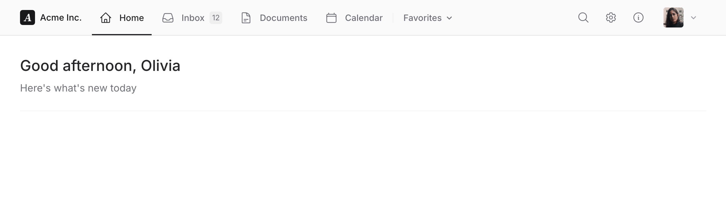
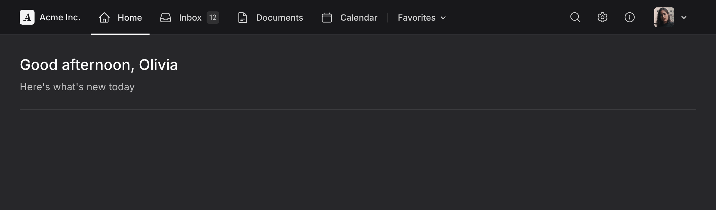
A full-width top navigation layout for your application.
Copy to clipboard
<head> <!-- ... --> @fluxAppearance</head><body class="min-h-screen bg-white dark:bg-zinc-800 antialiased"> <flux:header container class="bg-zinc-50 dark:bg-zinc-900 border-b border-zinc-200 dark:border-zinc-700"> <flux:sidebar.toggle class="lg:hidden" icon="bars-2" inset="left" /> <flux:brand href="#" logo="https://fluxui.dev/img/demo/logo.png" name="Acme Inc." class="max-lg:hidden dark:hidden" /> <flux:brand href="#" logo="https://fluxui.dev/img/demo/dark-mode-logo.png" name="Acme Inc." class="max-lg:hidden! hidden dark:flex" /> <flux:navbar class="-mb-px max-lg:hidden"> <flux:navbar.item icon="home" href="#" current>Home</flux:navbar.item> <flux:navbar.item icon="inbox" badge="12" href="#">Inbox</flux:navbar.item> <flux:navbar.item icon="document-text" href="#">Documents</flux:navbar.item> <flux:navbar.item icon="calendar" href="#">Calendar</flux:navbar.item> <flux:separator vertical variant="subtle" class="my-2"/> <flux:dropdown class="max-lg:hidden"> <flux:navbar.item icon:trailing="chevron-down">Favorites</flux:navbar.item> <flux:navmenu> <flux:navmenu.item href="#">Marketing site</flux:navmenu.item> <flux:navmenu.item href="#">Android app</flux:navmenu.item> <flux:navmenu.item href="#">Brand guidelines</flux:navmenu.item> </flux:navmenu> </flux:dropdown> </flux:navbar> <flux:spacer /> <flux:navbar class="me-4"> <flux:navbar.item icon="magnifying-glass" href="#" label="Search" /> <flux:navbar.item class="max-lg:hidden" icon="cog-6-tooth" href="#" label="Settings" /> <flux:navbar.item class="max-lg:hidden" icon="information-circle" href="#" label="Help" /> </flux:navbar> <flux:dropdown position="top" align="start"> <flux:profile avatar="https://fluxui.dev/img/demo/user.png" /> <flux:menu> <flux:menu.radio.group> <flux:menu.radio checked>Olivia Martin</flux:menu.radio> <flux:menu.radio>Truly Delta</flux:menu.radio> </flux:menu.radio.group> <flux:menu.separator /> <flux:menu.item icon="arrow-right-start-on-rectangle">Logout</flux:menu.item> </flux:menu> </flux:dropdown> </flux:header> <flux:sidebar sticky collapsible="mobile" class="lg:hidden bg-zinc-50 dark:bg-zinc-900 border-r border-zinc-200 dark:border-zinc-700"> <flux:sidebar.header> <flux:sidebar.brand href="#" logo="https://fluxui.dev/img/demo/logo.png" logo:dark="https://fluxui.dev/img/demo/dark-mode-logo.png" name="Acme Inc." /> <flux:sidebar.collapse class="in-data-flux-sidebar-on-desktop:not-in-data-flux-sidebar-collapsed-desktop:-mr-2" /> </flux:sidebar.header> <flux:sidebar.nav> <flux:sidebar.item icon="home" href="#" current>Home</flux:sidebar.item> <flux:sidebar.item icon="inbox" badge="12" href="#">Inbox</flux:sidebar.item> <flux:sidebar.item icon="document-text" href="#">Documents</flux:sidebar.item> <flux:sidebar.item icon="calendar" href="#">Calendar</flux:sidebar.item> <flux:sidebar.group expandable heading="Favorites" class="grid"> <flux:sidebar.item href="#">Marketing site</flux:sidebar.item> <flux:sidebar.item href="#">Android app</flux:sidebar.item> <flux:sidebar.item href="#">Brand guidelines</flux:sidebar.item> </flux:sidebar.group> </flux:sidebar.nav> <flux:sidebar.spacer /> <flux:sidebar.nav> <flux:sidebar.item icon="cog-6-tooth" href="#">Settings</flux:sidebar.item> <flux:sidebar.item icon="information-circle" href="#">Help</flux:sidebar.item> </flux:sidebar.nav> </flux:sidebar> <flux:main container> <flux:heading size="xl" level="1">Good afternoon, Olivia</flux:heading> <flux:text class="mt-2 mb-6 text-base">Here's what's new today</flux:text> <flux:separator variant="subtle" /> </flux:main> @fluxScripts</body>Inset main
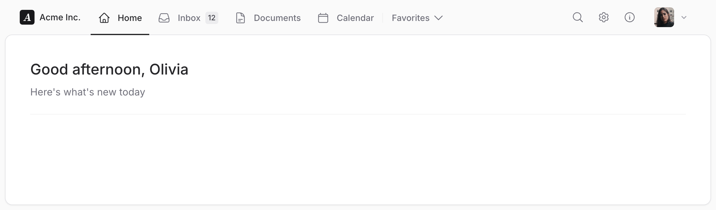
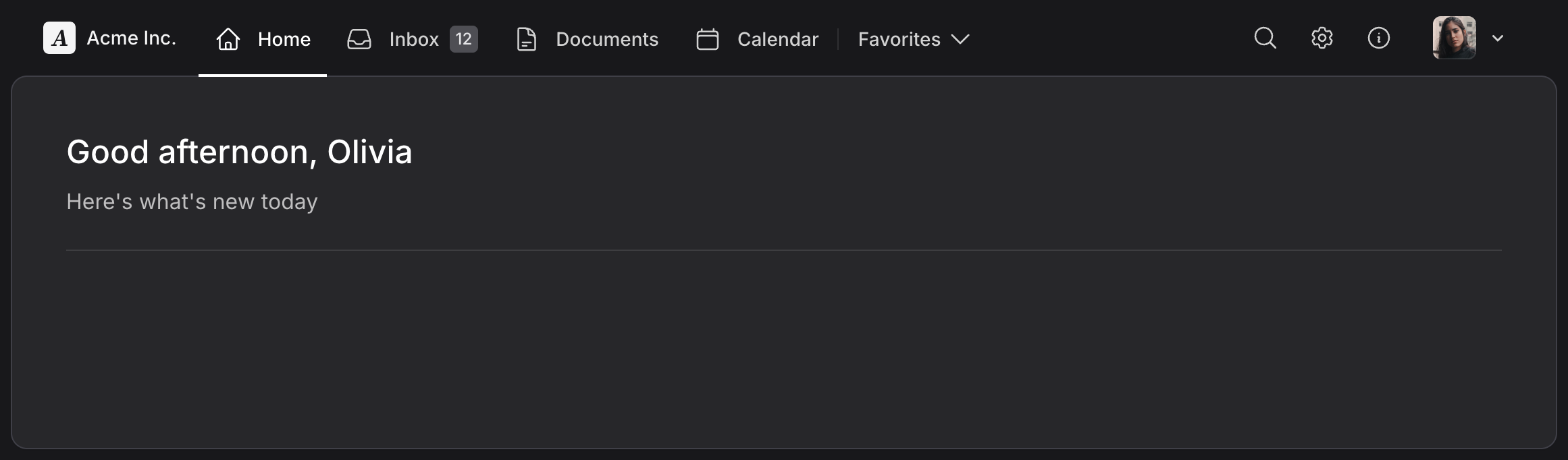
Add inset to flux:main to place your content in a bordered panel with rounded corners.
On large screens, content scrolls inside the panel, keeping its border and the space around it visible. On smaller screens, the panel becomes full width and the page scrolls normally.
Copy to clipboard
<head> <!-- ... --> @fluxAppearance</head><body class="min-h-dvh bg-zinc-50 dark:bg-zinc-900"> <flux:header class="bg-zinc-50 dark:bg-zinc-900"> <flux:sidebar.toggle class="lg:hidden" icon="bars-2" inset="left" /> <flux:brand href="#" logo="https://fluxui.dev/img/demo/logo.png" name="Acme Inc." class="max-lg:hidden dark:hidden" /> <flux:brand href="#" logo="https://fluxui.dev/img/demo/dark-mode-logo.png" name="Acme Inc." class="max-lg:hidden! hidden dark:flex" /> <flux:navbar class="-mb-px max-lg:hidden"> <flux:navbar.item icon="home" href="#" current>Home</flux:navbar.item> <flux:navbar.item icon="inbox" badge="12" href="#">Inbox</flux:navbar.item> <flux:navbar.item icon="document-text" href="#">Documents</flux:navbar.item> <flux:navbar.item icon="calendar" href="#">Calendar</flux:navbar.item> <flux:separator vertical variant="subtle" class="my-2"/> <flux:dropdown class="max-lg:hidden"> <flux:navbar.item icon:trailing="chevron-down">Favorites</flux:navbar.item> <flux:navmenu> <flux:navmenu.item href="#">Marketing site</flux:navmenu.item> <flux:navmenu.item href="#">Android app</flux:navmenu.item> <flux:navmenu.item href="#">Brand guidelines</flux:navmenu.item> </flux:navmenu> </flux:dropdown> </flux:navbar> <flux:spacer /> <flux:navbar class="mr-4"> <flux:navbar.item icon="magnifying-glass" href="#" label="Search" /> <flux:navbar.item class="max-lg:hidden" icon="cog-6-tooth" href="#" label="Settings" /> <flux:navbar.item class="max-lg:hidden" icon="information-circle" href="#" label="Help" /> </flux:navbar> <flux:dropdown position="top" align="start"> <flux:profile avatar="https://fluxui.dev/img/demo/user.png" /> <flux:menu> <flux:menu.radio.group> <flux:menu.radio checked>Olivia Martin</flux:menu.radio> <flux:menu.radio>Truly Delta</flux:menu.radio> </flux:menu.radio.group> <flux:menu.separator /> <flux:menu.item icon="arrow-right-start-on-rectangle">Logout</flux:menu.item> </flux:menu> </flux:dropdown> </flux:header> <flux:sidebar sticky collapsible="mobile" class="lg:hidden bg-zinc-50 dark:bg-zinc-900"> <flux:sidebar.header> <flux:sidebar.brand href="#" logo="https://fluxui.dev/img/demo/logo.png" logo:dark="https://fluxui.dev/img/demo/dark-mode-logo.png" name="Acme Inc." /> <flux:sidebar.collapse class="in-data-flux-sidebar-on-desktop:not-in-data-flux-sidebar-collapsed-desktop:-mr-2" /> </flux:sidebar.header> <flux:sidebar.nav> <flux:sidebar.item icon="home" href="#" current>Home</flux:sidebar.item> <flux:sidebar.item icon="inbox" badge="12" href="#">Inbox</flux:sidebar.item> <flux:sidebar.item icon="document-text" href="#">Documents</flux:sidebar.item> <flux:sidebar.item icon="calendar" href="#">Calendar</flux:sidebar.item> <flux:sidebar.group expandable heading="Favorites" class="grid"> <flux:sidebar.item href="#">Marketing site</flux:sidebar.item> <flux:sidebar.item href="#">Android app</flux:sidebar.item> <flux:sidebar.item href="#">Brand guidelines</flux:sidebar.item> </flux:sidebar.group> </flux:sidebar.nav> <flux:sidebar.spacer /> <flux:sidebar.nav> <flux:sidebar.item icon="cog-6-tooth" href="#">Settings</flux:sidebar.item> <flux:sidebar.item icon="information-circle" href="#">Help</flux:sidebar.item> </flux:sidebar.nav> </flux:sidebar> <flux:main inset container class="lg:mt-0"> <flux:heading size="xl" level="1">Good afternoon, Olivia</flux:heading> <flux:text class="mt-2 mb-6 text-base">Here's what's new today</flux:text> <flux:separator variant="subtle" /> </flux:main> @fluxScripts</body>Set the background around the panel on your layout and header. Add lg:mt-0 to the main to remove the margin below the header.
Add container to center the content inside the full-width panel. Keep the header and main as direct siblings so the panel can adjust to the header's height.
Secondary sidebar
Use a sidebar for secondary navigation.
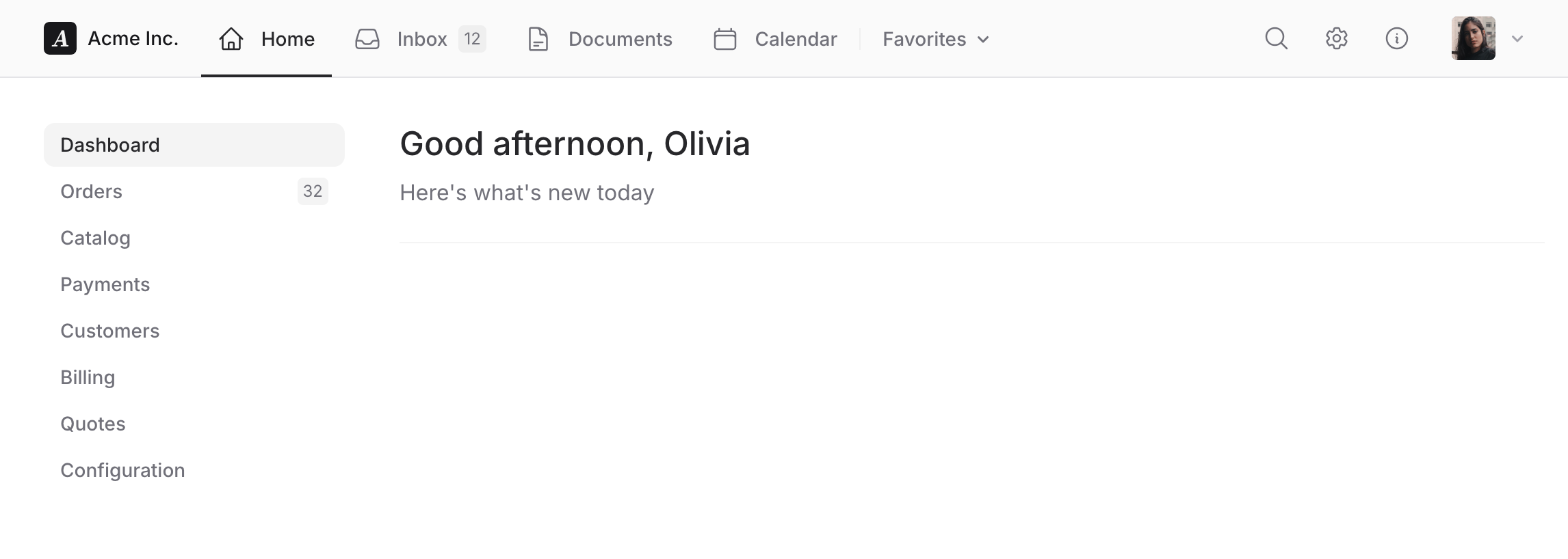
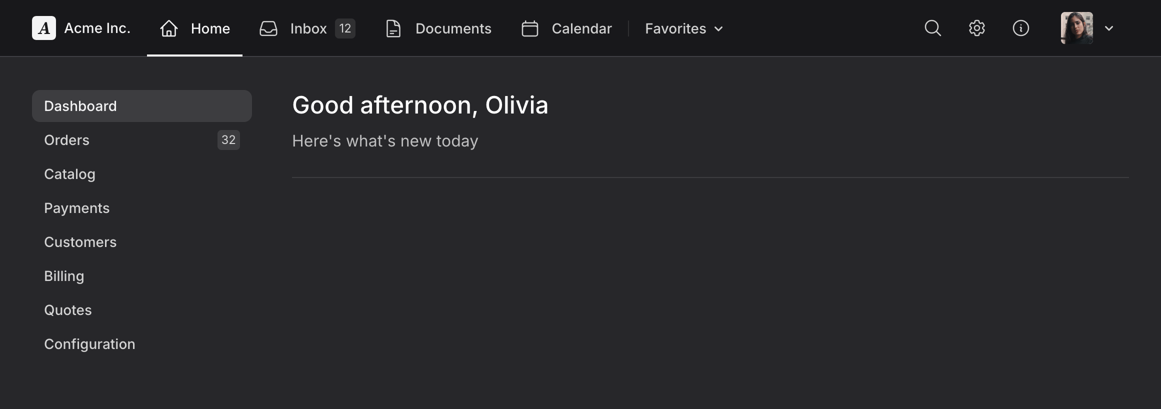
Copy to clipboard
<head> <!-- ... --> @fluxAppearance</head><body class="min-h-screen bg-white dark:bg-zinc-800 antialiased"> <flux:header container class="bg-zinc-50 dark:bg-zinc-900 border-b border-zinc-200 dark:border-zinc-700"> <flux:sidebar.toggle class="lg:hidden" icon="bars-2" /> <flux:brand href="#" logo="https://fluxui.dev/img/demo/logo.png" name="Acme Inc." class="max-lg:hidden dark:hidden" /> <flux:brand href="#" logo="https://fluxui.dev/img/demo/dark-mode-logo.png" name="Acme Inc." class="max-lg:hidden! hidden dark:flex" /> <flux:navbar class="-mb-px max-lg:hidden"> <flux:navbar.item icon="home" href="#" current>Home</flux:navbar.item> <flux:navbar.item icon="inbox" badge="12" href="#">Inbox</flux:navbar.item> <flux:navbar.item icon="document-text" href="#">Documents</flux:navbar.item> <flux:navbar.item icon="calendar" href="#">Calendar</flux:navbar.item> <flux:separator vertical variant="subtle" class="my-2"/> <flux:dropdown class="max-lg:hidden"> <flux:navbar.item icon:trailing="chevron-down">Favorites</flux:navbar.item> <flux:navmenu> <flux:navmenu.item href="#">Marketing site</flux:navmenu.item> <flux:navmenu.item href="#">Android app</flux:navmenu.item> <flux:navmenu.item href="#">Brand guidelines</flux:navmenu.item> </flux:navmenu> </flux:dropdown> </flux:navbar> <flux:spacer /> <flux:navbar class="me-4"> <flux:navbar.item icon="magnifying-glass" href="#" label="Search" /> <flux:navbar.item class="max-lg:hidden" icon="cog-6-tooth" href="#" label="Settings" /> <flux:navbar.item class="max-lg:hidden" icon="information-circle" href="#" label="Help" /> </flux:navbar> <flux:dropdown position="top" align="start"> <flux:profile avatar="https://fluxui.dev/img/demo/user.png" /> <flux:menu> <flux:menu.radio.group> <flux:menu.radio checked>Olivia Martin</flux:menu.radio> <flux:menu.radio>Truly Delta</flux:menu.radio> </flux:menu.radio.group> <flux:menu.separator /> <flux:menu.item icon="arrow-right-start-on-rectangle">Logout</flux:menu.item> </flux:menu> </flux:dropdown> </flux:header> <flux:sidebar sticky collapsible="mobile" class="lg:hidden bg-zinc-50 dark:bg-zinc-900 border-r border-zinc-200 dark:border-zinc-700"> <flux:sidebar.header> <flux:sidebar.brand href="#" logo="https://fluxui.dev/img/demo/logo.png" logo:dark="https://fluxui.dev/img/demo/dark-mode-logo.png" name="Acme Inc." /> <flux:sidebar.collapse class="in-data-flux-sidebar-on-desktop:not-in-data-flux-sidebar-collapsed-desktop:-mr-2" /> </flux:sidebar.header> <flux:sidebar.nav> <flux:sidebar.item icon="home" href="#" current>Home</flux:sidebar.item> <flux:sidebar.item icon="inbox" badge="12" href="#">Inbox</flux:sidebar.item> <flux:sidebar.item icon="document-text" href="#">Documents</flux:sidebar.item> <flux:sidebar.item icon="calendar" href="#">Calendar</flux:sidebar.item> <flux:sidebar.group expandable heading="Favorites" class="grid"> <flux:sidebar.item href="#">Marketing site</flux:sidebar.item> <flux:sidebar.item href="#">Android app</flux:sidebar.item> <flux:sidebar.item href="#">Brand guidelines</flux:sidebar.item> </flux:sidebar.group> </flux:sidebar.nav> <flux:sidebar.spacer /> <flux:sidebar.nav> <flux:sidebar.item icon="cog-6-tooth" href="#">Settings</flux:sidebar.item> <flux:sidebar.item icon="information-circle" href="#">Help</flux:sidebar.item> </flux:sidebar.nav> </flux:sidebar> <flux:main container> <div class="flex max-md:flex-col items-start"> <div class="w-full md:w-[220px] pb-4 me-10"> <flux:navlist> <flux:navlist.item href="#" current>Dashboard</flux:navlist.item> <flux:navlist.item href="#" badge="32">Orders</flux:navlist.item> <flux:navlist.item href="#">Catalog</flux:navlist.item> <flux:navlist.item href="#">Payments</flux:navlist.item> <flux:navlist.item href="#">Customers</flux:navlist.item> <flux:navlist.item href="#">Billing</flux:navlist.item> <flux:navlist.item href="#">Quotes</flux:navlist.item> <flux:navlist.item href="#">Configuration</flux:navlist.item> </flux:navlist> </div> <flux:separator class="md:hidden" /> <div class="flex-1 max-md:pt-6 self-stretch"> <flux:heading size="xl" level="1">Good afternoon, Olivia</flux:heading> <flux:text class="mb-6 mt-2 text-base">Here's what's new today</flux:text> <flux:separator variant="subtle" /> </div> </div> </flux:main> @fluxScripts</body>Related components
Reference
flux:header
|
Prop
|
Description
|
|---|---|
| sticky |
When present, makes the header sticky when scrolling.
|
| container |
When present, constrains the header content to a container width.
|
|
Slot
|
Description
|
|---|---|
| default |
Content to display within the header, typically including branding, navigation, and user profile elements.
|
|
CSS
|
Description
|
|---|---|
| class |
Additional CSS classes applied to the header. Common uses: bg-zinc-50, border-b, sticky, etc.
|
flux:sidebar.toggle
|
Attribute
|
Description
|
|---|---|
| icon |
The icon to display in the toggle button (e.g., bars-2, x-mark).
|
| inset |
Positioning of the toggle button (e.g., left).
|
|
CSS
|
Description
|
|---|---|
| class |
Additional CSS classes applied to the toggle button. Common uses: lg:hidden to show only on mobile.
|
flux:main
|
Prop
|
Description
|
|---|---|
| inset |
Displays the main content in a bordered surface with rounded corners and outer gutters on large screens. The layout fills the viewport and the main scrolls internally. On smaller screens, the main is full width and uses normal page scrolling.
|
| container |
When present, constrains the main content to a container width. With
inset, the content is centered inside the full-width surface. |
|
Slot
|
Description
|
|---|---|
| default |
Content to display within the main content area.
|
Copyright © 2026 Wireable LLC ·Terms of Service