The Changelog
What's new around here?
Succinct and informative updates about Flux.
November 25, 2025
Slider
Version ^2.8.0

Whether you're building a price filter, adjusting settings, or selecting a range of values, sliders are a natural fit for countless interfaces. Flux now ships with a fully-featured Slider component.
Let's take a look.
Copy to clipboard
<flux:slider wire:model="employees" />Range selection

Need to select a range instead of a single value? Add the range prop and you get two thumbs—perfect for price ranges, date ranges, or any min/max filtering.
Copy to clipboard
<flux:slider range wire:model="budget" />Bind to an array in your Livewire component and both values update in real-time:
Copy to clipboard
public array $range = [200, 800];Fine-tuned control
Configure the slider exactly how you need it with min, max, step, and min-steps-between:
Copy to clipboard
<flux:slider range min="0" max="1000" step="10" min-steps-between="10"/>The min-steps-between prop ensures your range thumbs maintain a minimum distance—so if your step is 10 and min-steps-between is 10, the thumbs will always be at least 100 units apart.
Visual markers

Add ticks below the slider to help users visualize steps and values. Show simple marks, numbers, or custom labels:
Copy to clipboard
<!-- Simple tick marks --><flux:slider min="1" max="5"> @foreach (range(1, 5) as $i) <flux:slider.tick :value="$i" /> @endforeach</flux:slider><!-- With numbers --><flux:slider min="1" max="5"> @foreach (range(1, 5) as $i) <flux:slider.tick :value="$i">{{ $i }}</flux:slider.tick> @endforeach</flux:slider><!-- Custom labels --><flux:slider min="1" max="5"> <flux:slider.tick value="1">Low</flux:slider.tick> <flux:slider.tick value="3">Mid</flux:slider.tick> <flux:slider.tick value="5">High</flux:slider.tick></flux:slider>Custom styling

Make it your own with track:class and thumb:class. Want a chunkier slider? No problem:
Copy to clipboard
<flux:slider track:class="h-3 bg-blue-600" thumb:class="size-5" />These props give you complete control over the appearance while keeping all the functionality intact.
The details that matter
We really sweat the details on this one and hope it shows.
Offset mouse tracking: When you click to drag a thumb, it doesn't snap the center of the thumb to your cursor—making precise adjustments feel natural and accurate, especially when moving just a step or two.
Intelligent thumb behavior: In range mode, the thumbs can't cross over each other and invert the range. The right thumb always stays on top when they're close together, preventing any confusion about which is which.
Big steps: Hold Shift while pressing arrow keys to jump by larger increments using the big-step prop—great for quickly covering large ranges.
Accessibility
And of course, we went to great lengths to make sure this component honors expected keyboard navigation, proper focus indicators, and appropriate ARIA labels so that screen readers can use it just as well. Arrow keys adjust values, and you can tab between thumbs in a range slider.
Check out the Slider documentation for more examples and the full API reference.
November 24, 2025
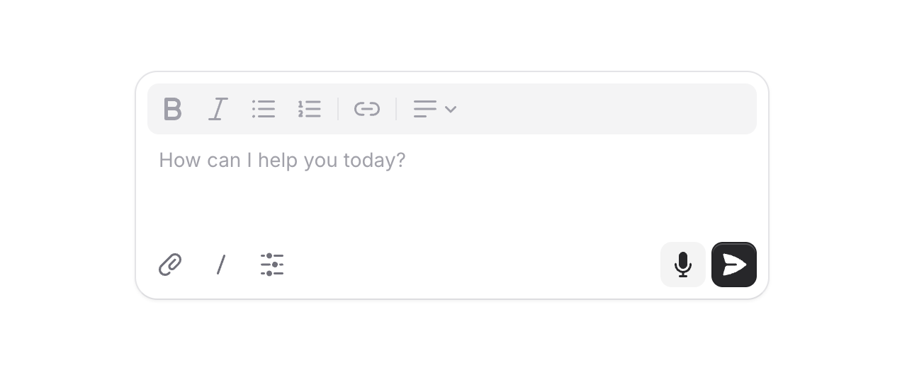
Composer
Version ^2.7.1

AI is everywhere, and chat interfaces are the new norm. We figured it was time Flux had a proper message input built for exactly this.
Meet Composer, a configurable message input with support for action buttons and rich text. Let's take a look.
Copy to clipboard
<flux:composer wire:model="prompt" placeholder="How can I help you today?"> <x-slot name="actionsLeading"> <flux:button size="sm" variant="subtle" icon="paper-clip" /> </x-slot> <x-slot name="actionsTrailing"> <flux:button type="submit" size="sm" variant="primary" icon="paper-airplane" /> </x-slot></flux:composer>Two layouts
By default, action buttons sit below the input in their own row. Add the inline prop to place them alongside the input for a more compact look—great for single-line prompts.
Copy to clipboard
<flux:composer inline rows="1" ...> ...</flux:composer>Rich text
Need formatting? Swap out the default textarea for a full rich text editor by passing an editor component to the input slot.
Copy to clipboard
<flux:composer wire:model="prompt" rows="3" ...> <x-slot name="input"> <flux:editor variant="borderless" toolbar="bold italic bullet ordered | link" /> </x-slot> ...</flux:composer>Submit behavior
By default, pressing Cmd/Ctrl + Enter submits the form. For a chat-style experience where Enter sends immediately, just add submit="enter".
Copy to clipboard
<flux:composer submit="enter" ...> ...</flux:composer>Height control
Set the initial height with rows and let it grow with max-rows. The input auto-expands as users type, then becomes scrollable.
Copy to clipboard
<flux:composer rows="4" max-rows="8" ...> ...</flux:composer>Accessibility
And of course, we went to great lengths to make sure this component honors expected keyboard navigation, focus behavior, and proper aria-labels so that screen readers can use it just as well.
Check out the Composer documentation for more examples and the full API reference.
October 15, 2025
Time picker
Version ^2.6.0

Introducing the Time Picker component—for when you need users to select specific times. Perfect for scheduling appointments, filtering by time ranges, or any scenario where precise time selection matters.
The component handles all the complexity: 12/24-hour formats, time intervals, unavailable slots, keyboard navigation, and proper localization.
Copy to clipboard
<flux:time-picker wire:model="appointmentTime" />Input or button trigger
Choose between a button trigger that opens a time selection dropdown, or an input trigger that gives you a native time input with optional dropdown enhancement:
Copy to clipboard
<flux:time-picker type="button" /><flux:time-picker type="input" />The input variant even lets you disable the dropdown entirely with :dropdown="false" if you want a pure native experience.
Control your intervals
Set the interval between displayed times with the interval prop. Default is 30 minutes, but you can use any number:
Copy to clipboard
<flux:time-picker interval="15" /> <!-- 15-minute intervals --><flux:time-picker interval="60" /> <!-- Hourly -->Min, max, and unavailable times
Restrict selectable times with min and max boundaries—perfect for business hours or time-based constraints:
Copy to clipboard
<flux:time-picker min="09:00" max="17:00" />There's even a convenient "now" shorthand:
Copy to clipboard
<flux:time-picker min="now" /> <!-- Only future times -->Need to block out specific times or time ranges? Use the unavailable prop to disable booked appointments or unavailable slots:
Copy to clipboard
<flux:time-picker unavailable="03:00,04:00,05:30-07:29" />Multiple time selection
Allow users to select multiple times with the multiple prop:
Copy to clipboard
<flux:time-picker multiple wire:model="availableTimes" />Automatic localization
The time picker automatically uses the browser's locale to determine time format, but you can override it:
Copy to clipboard
<flux:time-picker time-format="12-hour" /><flux:time-picker time-format="24-hour" /><flux:time-picker locale="ja-JP" />The details
Like every component in Flux, we left no stone unturned:
Keyboard friendly: Full keyboard navigation with arrow keys, Enter to select, and Escape to close. Screen readers announce all state changes and available options.
Smart defaults: The picker opens to the currently selected time, or the current time if nothing is selected. You can override this with open-to if needed.
Seamless integration: Works with all standard field props like label, description, and badge for automatic field wrapping.