The Changelog
What's new around here?
Succinct and informative updates about Flux.
November 26, 2025
Kanban
Version ^2.9.0
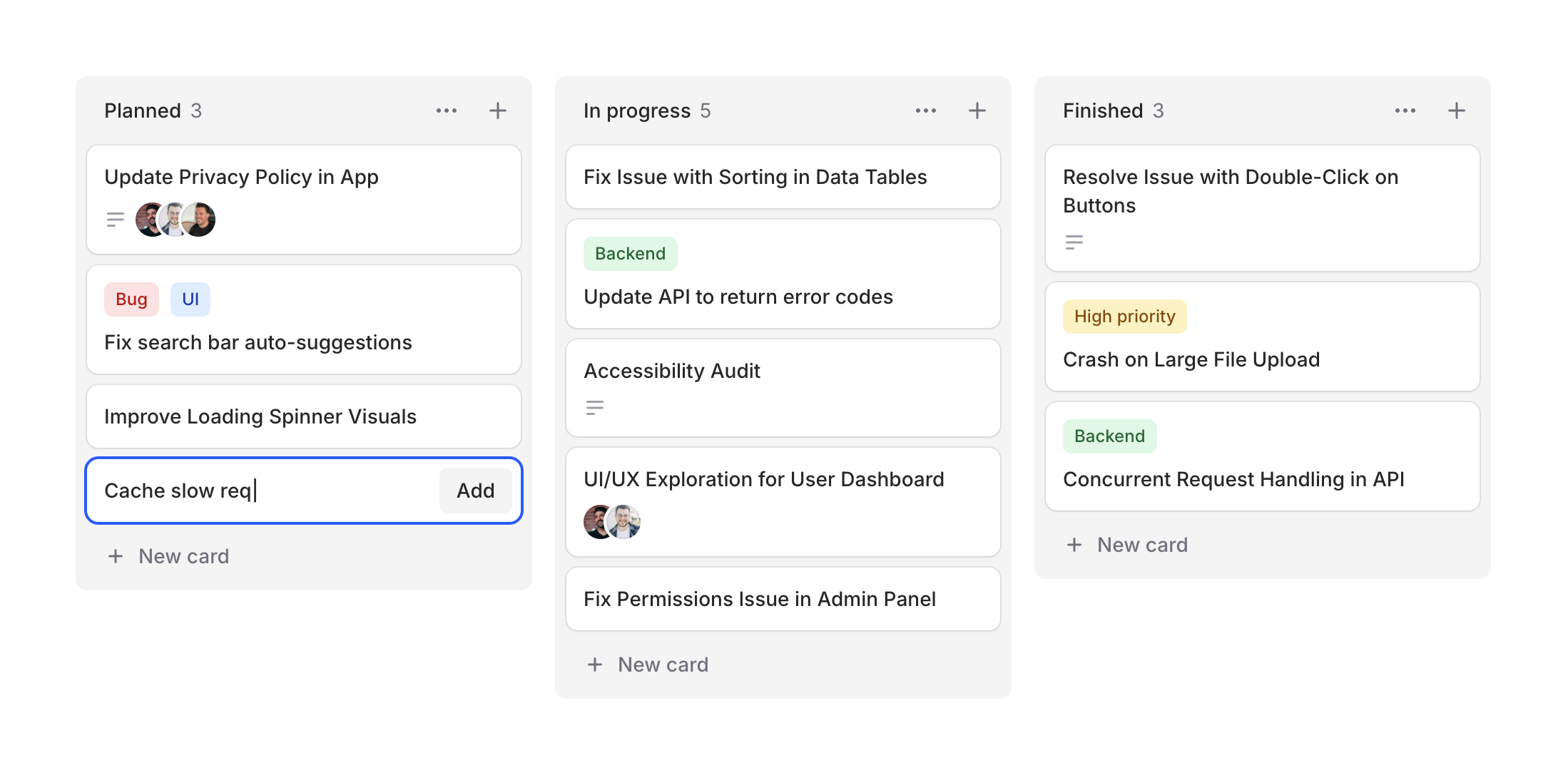
Project management, task tracking, workflow visualization—kanban boards are everywhere. Designing them from scratch can be tedious, so we figured Flux should make it easy.
Cheeck out our new Kanban system, a collection of components for building beautiful workflow boards. Take a look.
Copy to clipboard
<flux:kanban> @foreach ($columns as $column) <flux:kanban.column> <flux:kanban.column.header :heading="$column->title" :count="count($column->cards)" /> <flux:kanban.column.cards> @foreach ($column->cards as $card) <flux:kanban.card :heading="$card->title" /> @endforeach </flux:kanban.column.cards> </flux:kanban.column> @endforeach</flux:kanban>Column arrangements
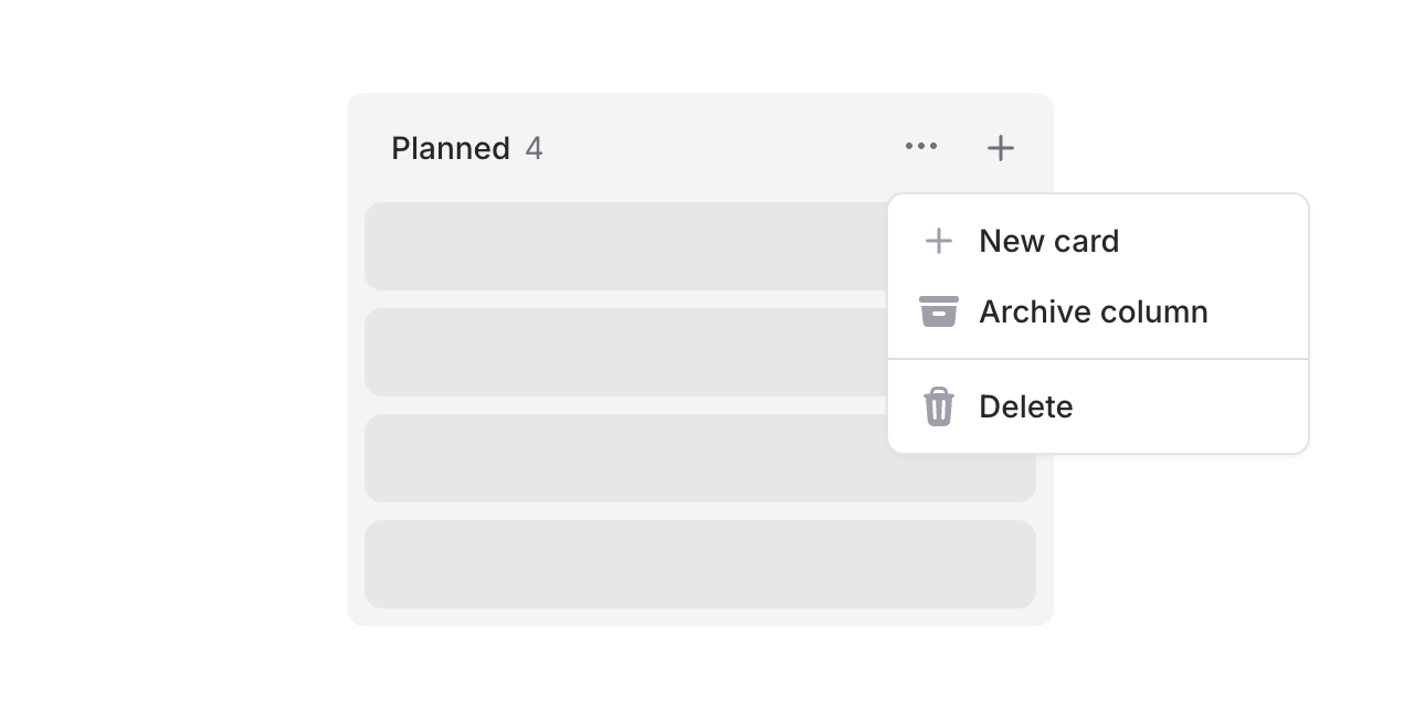
Columns support headings, counts, and action slots. Add dropdowns for column management or quick-add buttons:
Copy to clipboard
<flux:kanban.column.header heading="In Progress" count="5"> <x-slot name="actions"> <flux:dropdown> <flux:button variant="subtle" icon="ellipsis-horizontal" size="sm" /> <flux:menu> <flux:menu.item icon="plus">New card</flux:menu.item> <!-- ... --> </flux:menu> </flux:dropdown> <flux:button variant="subtle" icon="plus" size="sm" /> </x-slot></flux:kanban.column.header>Flexible cards
Cards are composable with header and footer slots for maximum flexibility.
Card headers
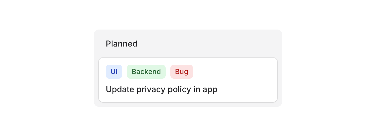
Use the header slot for badges, tags, or labels:
Copy to clipboard
<flux:kanban.card heading="Update privacy policy"> <x-slot name="header"> <div class="flex gap-2"> <flux:badge color="blue" size="sm">UI</flux:badge> <flux:badge color="green" size="sm">Backend</flux:badge> <flux:badge color="red" size="sm">Bug</flux:badge> </div> </x-slot></flux:kanban.card>Card footers
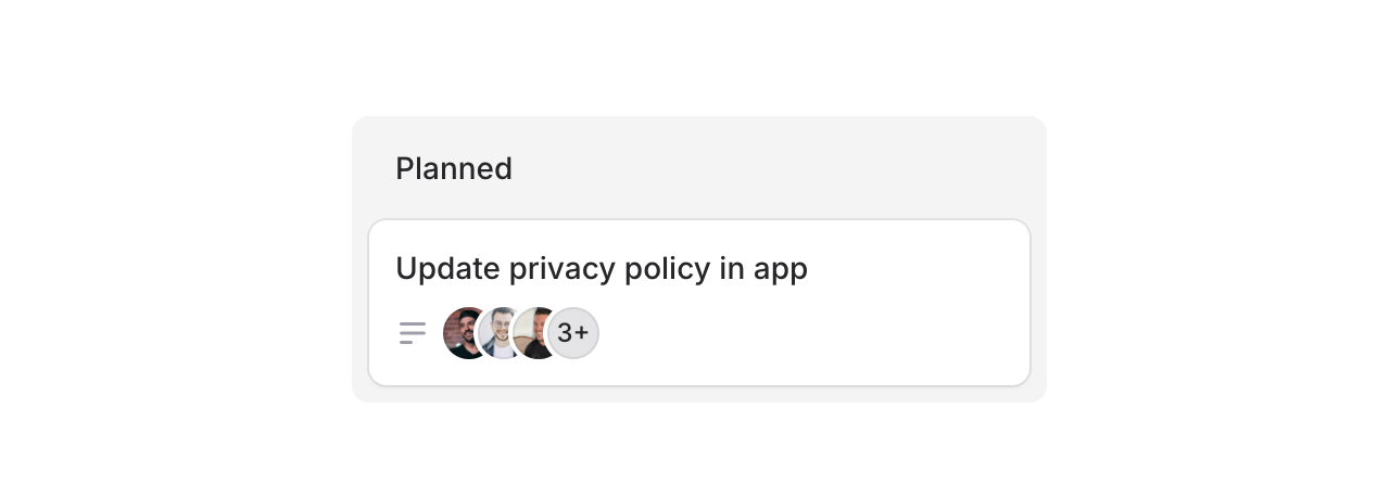
Use the footer slot for avatars, icons, or metadata:
Copy to clipboard
<flux:kanban.card heading="Update privacy policy"> <x-slot name="footer"> <flux:icon name="bars-3-bottom-left" variant="micro" class="text-zinc-400" /> <flux:avatar.group> <flux:avatar circle size="xs" src="..." /> <!-- ... --> </flux:avatar.group> </x-slot></flux:kanban.card>Cards can also be made clickable with as="button" to open modals or detail views:
Copy to clipboard
<flux:kanban.card as="button" wire:click="edit({{ $card->id }})" heading="{{ $card->title }}"> <!-- ... --></flux:kanban.card>Drag & drop
Flux doesn't ship with drag-and-drop features, but you can add them using Alpine's x-sort plugin or preferably wire:sort in Livewire 4 (currently in beta):
Copy to clipboard
<flux:kanban wire:sort="moveColumn"> @foreach ($columns as $column) <flux:kanban.column :wire:key="$column->id" :wire:sort:item="$column->id" > <flux:kanban.column.header :heading="$column->title" :count="count($column->cards)" /> <flux:kanban.column.cards wire:sort="moveCards"> @foreach ($column->cards as $card) <flux:kanban.card :heading="$card->title" :wire:key="$card->id" :wire:sort:item="$card->id" /> @endforeach </flux:kanban.column.cards> </flux:kanban.column> @endforeach</flux:kanban>Check out the Kanban documentation for more examples and the full API reference.
November 26, 2025
Skeleton
Version ^2.9.0

Loading states matter. A well-designed skeleton keeps users engaged while content loads, making your app feel faster and more polished.
Introducing Skeleton, a flexible component for creating placeholder content.
Copy to clipboard
<flux:skeleton.group animate="shimmer" class="flex items-center gap-4"> <flux:skeleton class="size-10 rounded-full" /> <div class="flex-1"> <flux:skeleton.line /> <flux:skeleton.line class="w-1/2" /> </div></flux:skeleton.group>Text placeholders

The skeleton.line component mimics real text—it occupies the full line-height but renders a slimmer bar, giving it the natural proportions of actual text:
Copy to clipboard
<flux:skeleton.group> <flux:skeleton.line class="mb-2 w-1/4" /> <flux:skeleton.line /> <flux:skeleton.line /> <flux:skeleton.line class="w-3/4" /></flux:skeleton.group>Animation options

Choose between shimmer and pulse animations, or go with no animation at all. The skeleton.group component lets you set the animation once and have all child skeletons inherit it:
Copy to clipboard
<!-- Shimmer animation --><flux:skeleton.group animate="shimmer"> <flux:skeleton.line /></flux:skeleton.group><!-- Pulse animation --><flux:skeleton.group animate="pulse"> <flux:skeleton.line /></flux:skeleton.group><!-- No animation --><flux:skeleton.line />Real-world examples
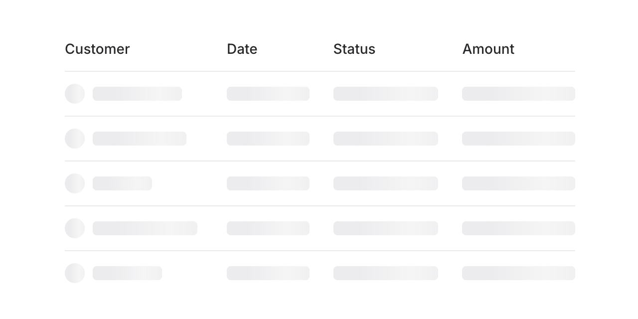
Build skeleton states for anything—tables, cards, charts, profiles. Here's a table loading state:
Copy to clipboard
<flux:skeleton.group animate="shimmer"> <flux:table> <flux:table.columns> <flux:table.column>Customer</flux:table.column> <flux:table.column>Date</flux:table.column> <flux:table.column>Status</flux:table.column> </flux:table.columns> <flux:table.rows> @foreach (range(1, 5) as $i) <flux:table.row> <flux:table.cell> <div class="flex items-center gap-2"> <flux:skeleton class="rounded-full size-5" /> <flux:skeleton.line /> </div> </flux:table.cell> <flux:table.cell> <flux:skeleton.line /> </flux:table.cell> <flux:table.cell> <flux:skeleton.line /> </flux:table.cell> </flux:table.row> @endforeach </flux:table.rows> </flux:table></flux:skeleton.group>Check out the Skeleton documentation for more examples and the full API reference.
November 25, 2025
OTP Input
Version ^2.8.0
Two-factor authentication, email verification codes, PIN entries—OTP inputs are everywhere. We figured Flux should handle them beautifully.
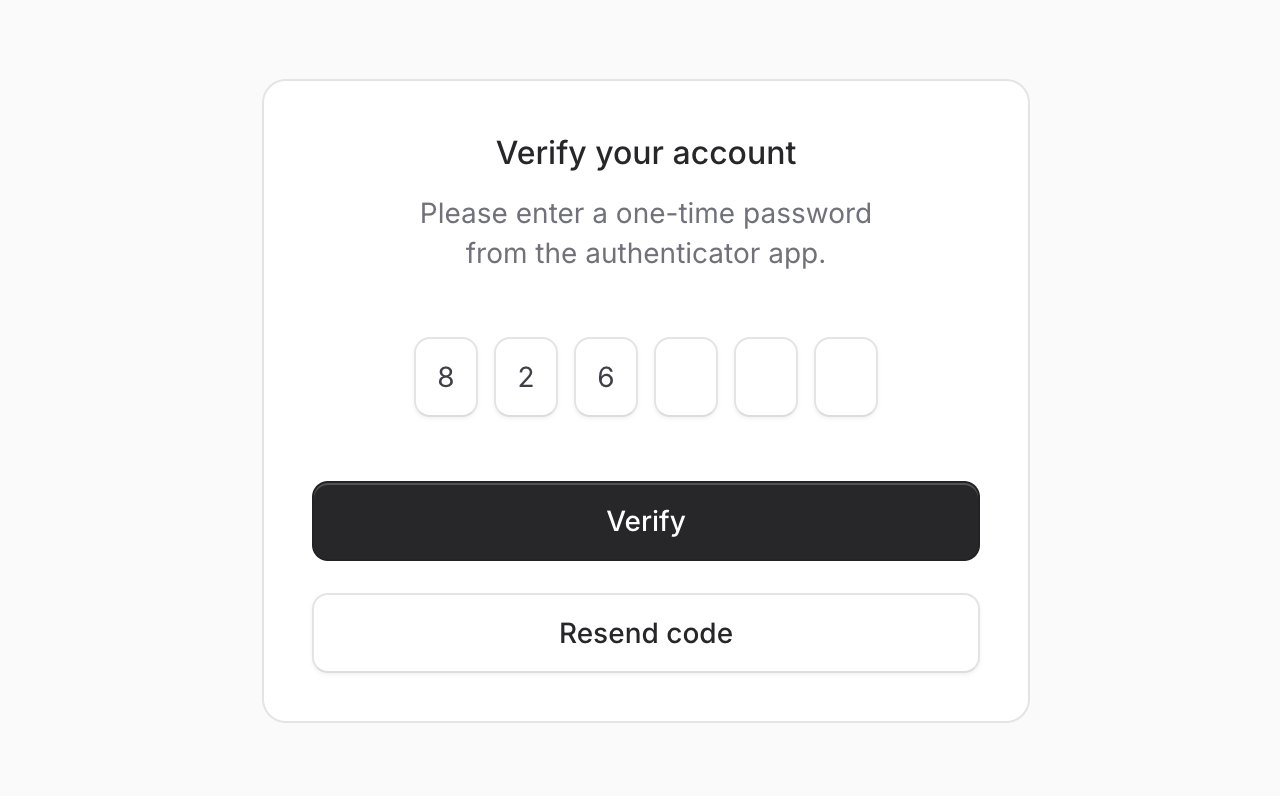
Meet OTP Input, a component for capturing one-time passwords with individual input fields. Let's take a look.
Copy to clipboard
<flux:otp wire:model="code" length="6" />Auto-submit
Add submit="auto" and the form submits automatically once all fields are filled—no submit button needed. Perfect for streamlined verification flows where speed matters.
Copy to clipboard
<flux:otp wire:model="code" length="6" submit="auto" />More than numbers
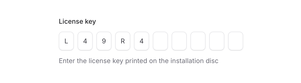
Need alphanumeric codes or PINs? The mode prop has you covered. Set it to alphanumeric for license keys, or use private to mask sensitive values like PIN codes.
Copy to clipboard
<!-- License keys --><flux:otp wire:model="licenseKey" length="10" mode="alphanumeric" /><!-- PIN codes --><flux:otp wire:model="pin" length="4" private />Custom layouts

Use separators and groups to match your design. Great for phone numbers, credit cards, or any grouped format:
Copy to clipboard
<flux:otp wire:model="code"> <flux:otp.group> <flux:otp.input /> <flux:otp.input /> <flux:otp.input /> </flux:otp.group> <flux:otp.separator /> <flux:otp.group> <flux:otp.input /> <flux:otp.input /> <flux:otp.input /> </flux:otp.group></flux:otp>Smart input behavior
As always we went to great lengths to make sure this component is world-class.
Smart paste: Paste an entire code and it automatically distributes the characters across all input fields—no need to manually type each digit.
Intelligent navigation: Arrow keys move between fields, backspace jumps back to clear previous digits, and typing automatically advances to the next field.
Autocomplete support: The first field includes autocomplete="one-time-code" by default, so browsers and password managers can automatically suggest codes from SMS or authenticator apps.
Accessibility
And of course, we made sure this component honors expected keyboard navigation, proper focus management, and appropriate ARIA labels so that screen readers can use it just as well. Each input announces its position and the total number of digits expected.
Check out the OTP Input documentation for more examples and the full API reference.