The Changelog
What's new around here?
Succinct and informative updates about Flux.
February 27, 2026
Progress bar
Version ^2.13.0
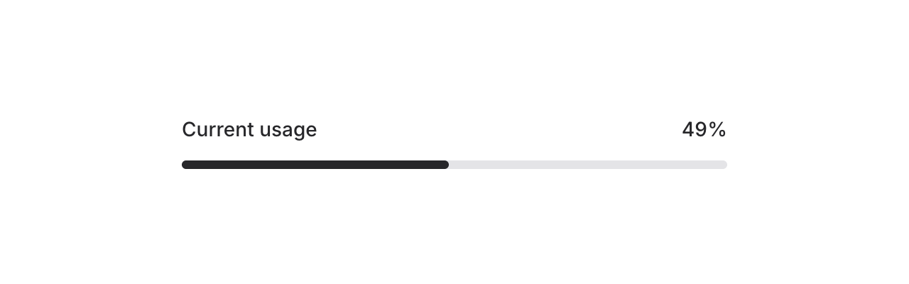
Meet the new Progress component — a simple, flexible progress bar for showing completion, upload status, or any value-over-max scenario in your app.
Copy to clipboard
<flux:progress value="75" />By default, the max is 100 and the bar uses your app's accent color. Let's take a look at what else it can do.
Custom max values
Not everything is a percentage. Use the max prop for custom scales — steps in a wizard, files in a batch, levels in a game, whatever:
Copy to clipboard
<flux:progress value="3" max="7" />Color and height

Override the fill color with the color prop, and adjust the height with a Tailwind class:
Copy to clipboard
<flux:progress value="75" color="purple" /><flux:progress value="75" class="h-3" />Dynamic binding
Bind the progress value to a Livewire property using wire:model so it updates in real-time:
Copy to clipboard
<flux:progress wire:model="progress" />This is perfect for long-running tasks like file uploads, data imports, or background jobs where you want to reflect server-side progress as it happens.
Accessibility
And of course, we went to great lengths to make sure this component honors expected keyboard navigation, focus behavior, and proper ARIA attributes so that screen readers can communicate progress status just as well.
February 9, 2026
Bar charts + chart builder
Version ^2.12.0
Flux charts just got a whole lot more powerful. As of v2.12.0, our chart component now supports bar charts — single bars, grouped bars, stacked bars, and even mixed line-and-bar charts.
We also built a dedicated chart builder → so you can visually design your chart and copy the code straight into your Blade templates.
Let's take a look.
Bars. Groups. Stacks.
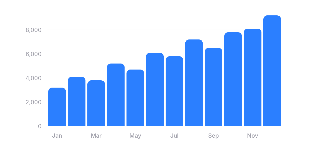
Adding a bar chart is as simple as swapping flux:chart.line for flux:chart.bar:
Copy to clipboard
<flux:chart wire:model="data" class="aspect-[3/1]"> <flux:chart.svg> <flux:chart.bar field="revenue" class="text-blue-500" /> <flux:chart.axis axis="x" field="date"> <flux:chart.axis.tick /> <flux:chart.axis.line /> </flux:chart.axis> <flux:chart.axis axis="y"> <flux:chart.axis.grid /> <flux:chart.axis.tick /> </flux:chart.axis> </flux:chart.svg></flux:chart>You can customize radius for rounded corners, width to control bar thickness, and min-height so small values still remain visible. Everything you'd expect.
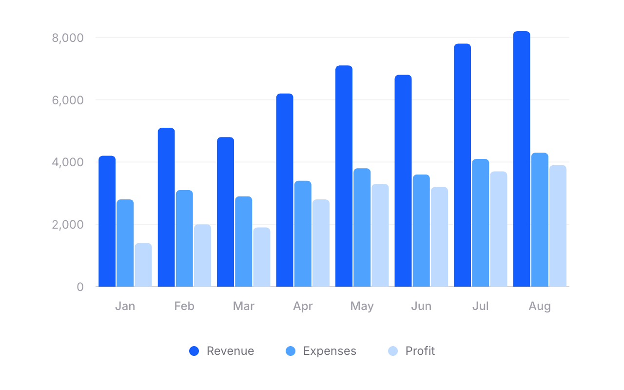
Grouped bars
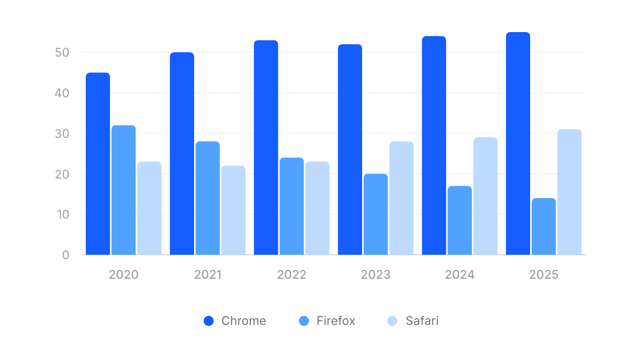
Need to compare multiple data series side by side? Wrap your bars in a flux:chart.group:
Copy to clipboard
<flux:chart wire:model="data"> <flux:chart.viewport class="aspect-[3/1]"> <flux:chart.svg> <flux:chart.group> <flux:chart.bar field="chrome" class="text-blue-600" /> <flux:chart.bar field="firefox" class="text-blue-500" /> <flux:chart.bar field="safari" class="text-blue-300" /> </flux:chart.group> <!-- ... axes ... --> </flux:chart.svg> </flux:chart.viewport> <div class="flex justify-center gap-4 pt-4"> <flux:chart.legend label="Chrome"> <flux:chart.legend.indicator class="bg-blue-600" /> </flux:chart.legend> <!-- ... --> </div></flux:chart>Stacked bars
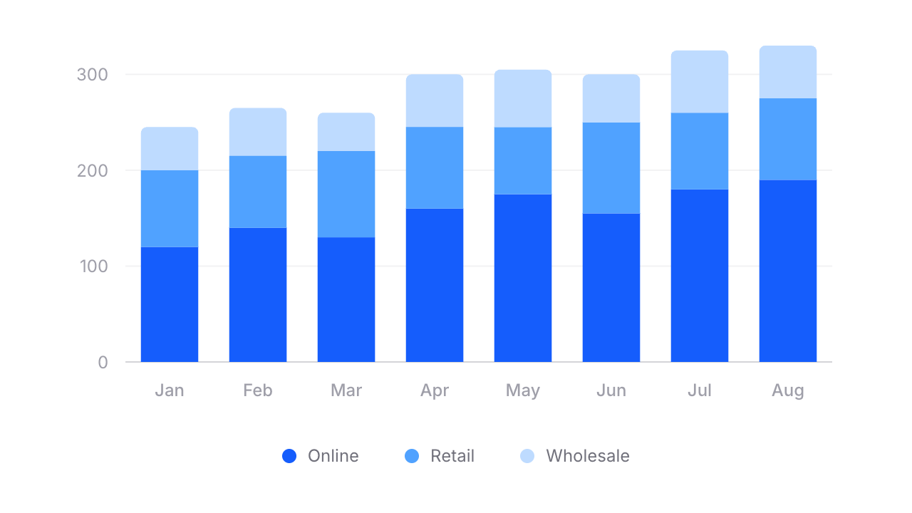
For stacked bars, swap flux:chart.group for flux:chart.stack:
Copy to clipboard
<flux:chart.stack width="65%"> <flux:chart.bar field="online" class="text-blue-600" /> <flux:chart.bar field="retail" class="text-blue-400" /> <flux:chart.bar field="wholesale" class="text-blue-300" radius="4 0" /></flux:chart.stack>Notice radius="4 0" on the last bar — that rounds only the top corners of the stack, giving it a clean, finished look.
Mix and match
Because Flux charts are fully composable, you can combine lines and bars in the same chart. Want a bar chart with a trend line overlaid? Just include both:
Copy to clipboard
<flux:chart wire:model="data"> <flux:chart.svg> <flux:chart.bar field="revenue" class="text-blue-300" /> <flux:chart.line field="trend" class="text-blue-600" /> <!-- ... --> </flux:chart.svg></flux:chart>No special config. No mode switching. Just composable components.
Build charts visually
Rather than fiddling with JSON configuration objects like most charting libraries, we built a chart builder where you can visually design your chart from start to finish. Pick a preset, configure your series, tweak axes and tooltips, then hit "Get code" and paste clean Blade markup straight into your project.
December 18, 2025
Create option + inline pillbox input
Version ^2.10.0
We've added a new Create option component to Flux allowing users to create bespoke options that don't appear in the original list.
Pair that with the new combobox variant on the pillbox component for an even more intuitive experience.
Let’s take a look at both of these new features.
New combobox variant
This variant allows typing and selection in a single, continuous flow, making it ideal for tags, labels, and search-driven interactions.
Copy to clipboard
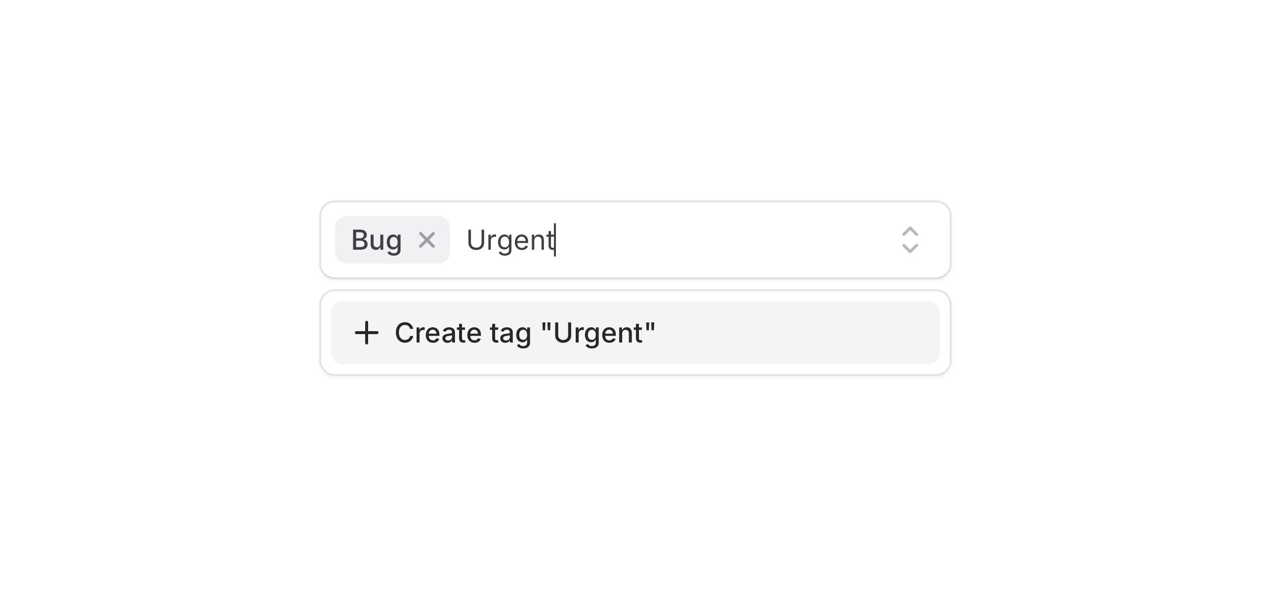
<flux:pillbox variant="combobox" multiple> <flux:pillbox.option value="javascript">JavaScript</flux:pillbox.option> <flux:pillbox.option value="typescript">TypeScript</flux:pillbox.option> <flux:pillbox.option value="php">PHP</flux:pillbox.option></flux:pillbox>New create option
Add the flux:pillbox.option.create component at the beginning or end of your options list, and Flux will automatically show it when the current search doesn’t match any existing option.
Copy to clipboard
<flux:pillbox wire:model="selectedTags" variant="combobox" multiple> <x-slot name="input"> <flux:pillbox.input wire:model="search" /> </x-slot> <!-- ... --> <flux:pillbox.option.create wire:click="createTag" min-length="2"> Create tag "<span wire:text="search"></span>" </flux:pillbox.option.create></flux:pillbox>Your create option logic can now live in your Livewire component and be easily wired up using wire:click.
Copy to clipboard
public function createTag(){ $tag = Tag::create(['name' => $this->search]); $this->selectedTags[] = $tag->id;}Smart validation
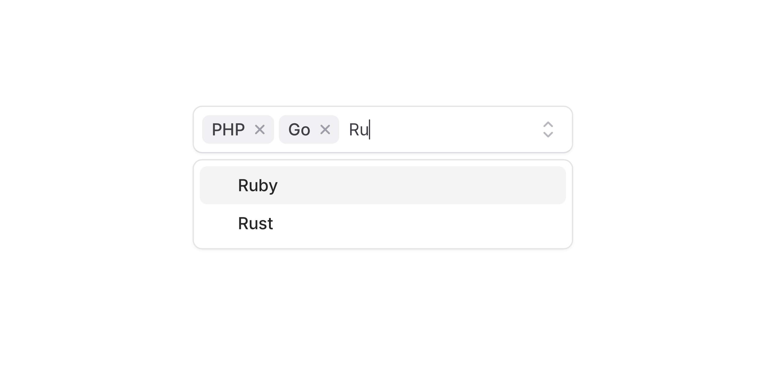
Flux handles common validation cases by default—like preventing duplicate options. It also supports accent-aware matching, so searches for Jose correctly match José.
Use min-length to control when the “create option” prompt appears. For full control, use Laravel validation rules; validation errors are reflected automatically.
Backend search
Using backend filtering? No problem. With :filter="false", Flux waits for the server response, then checks whether the option is unique. The create option is also disabled while a request is in flight, preventing duplicate submissions.
Modals
Use the modal prop when creation requires more than a single action. This is useful for more complex workflows—such as collecting additional fields or running validation inside a dedicated form.
Copy to clipboard
<flux:pillbox.option.create modal="create-tag"> <!-- ... --></flux:pillbox.option.create><flux:modal name="create-tag"> <!-- ... --></flux:modal>Select support
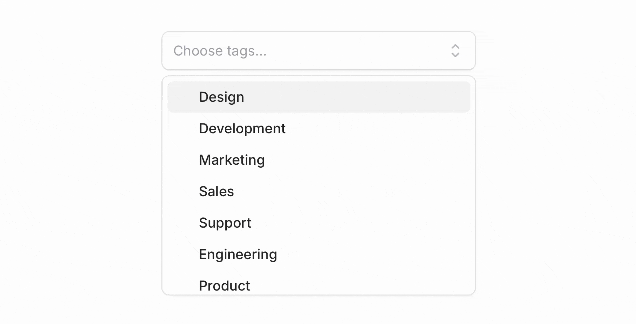
The create option works with Select as well. You can use it in both searchable select and combobox variants, with the same behavior and API.
Copy to clipboard
<flux:select wire:model="projectId" variant="combobox"> <x-slot name="input"> <flux:select.input wire:model="search" /> </x-slot> <!-- ... --> <flux:select.option.create wire:click="createProject" min-length="2"> Create project "<span wire:text="search"></span>" </flux:select.option.create></flux:select>Accessibility
And of course, we went to great lengths to make sure the create option and combobox flow honor expected keyboard navigation, focus behavior, and proper ARIA labels so that screen readers can use it just as well.
Check out the Pillbox documentation and Select documentation for more examples and the full API reference.