The Changelog
What's new around here?
Succinct and informative updates about Flux.
December 17, 2024
Theming in Flux
Version ^1.1.0

Don't want your Flux app looking like everybody else's? We've got you covered. Flux is now completely themeable!
Three colors, one accent
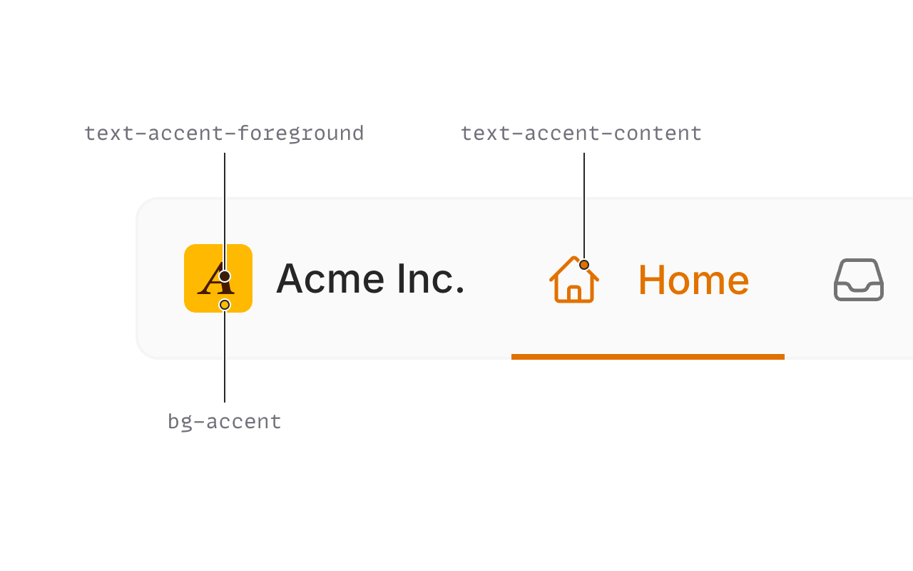
In a perfect world, you could pick a single accent color to theme your entire app. Unfortunately, we found this to be a pipe dream. Instead, we've learned you need no fewer than three accent colors in a system that can support every hue:
- The base accent color. Used for things like the primary button background
- A foreground color. This sits on-top of the base accent color; often used in text.
- A content color. A stronger variant of the accent color for thinner figures like text.
We can then tweak those colors using opacity or color-mix() for specific needs, but those are the three core colors to work off of.
Hand picked colors
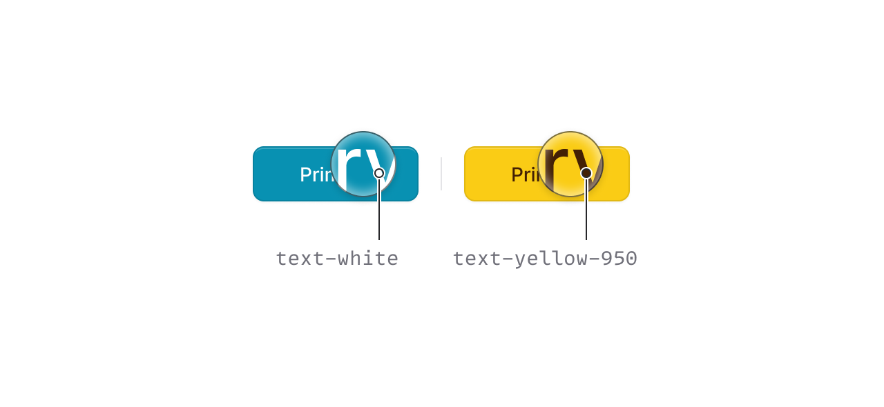
We've curated themes for every color in the Tailwind color palette. Each combination is hand selected to make sure it looks just right.
For example, we chose a dark foreground color, instead of white, when an accent color like yellow is too light to meet color contrast standards.
Dark mode
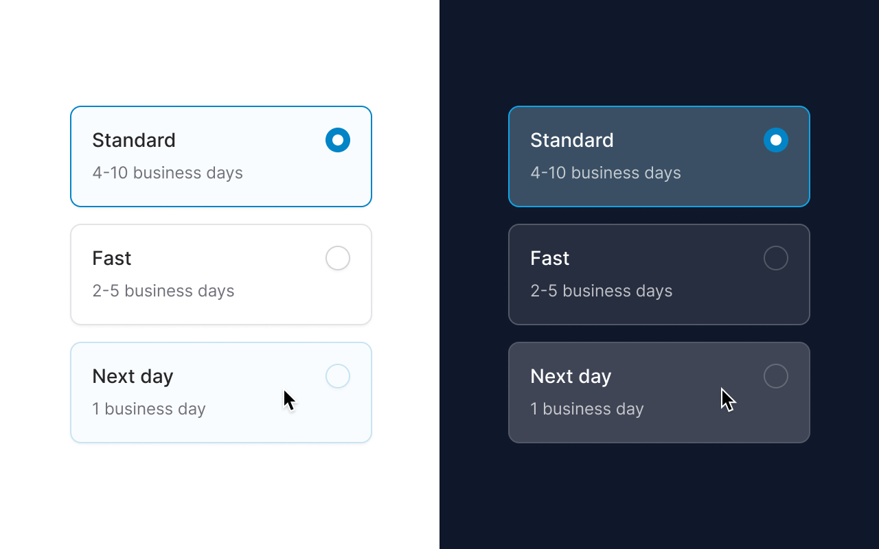
Of course each theme has dark mode baked in, but this is not your mother's dark mode.
There are plenty of places where we went a completely different route stylistically to make sure all designs "feel" the same in both light and dark mode.
One example is when you hover over a radio card in light mode, the background and border are set to a subtle hue of your accent color, however, in dark mode, the card is just a lighter shade of gray.
This is because when you add color to an element in light mode it looks lighter and therefore closer to the user. But when you add color to an element in dark mode, it looks DARKER, and therefore further from the user and more blended with the background. In these cases, we've mixed the color with extra white—using transparency—or left the color out completely.
Opt-out
Some components are themed by default that you may want to render as a base color instead.
In these cases, we've added an accent prop that you can use to opt-out of the themed version.
Here's an example of rendering a link in black/white instead of your accent color:
Copy to clipboard
<flux:link :accent="false">Profile</flux:tab>Choose your gray
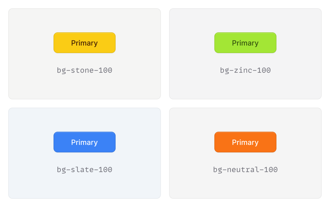
Flux ships with zinc as its gray hue of choice. This looks clean and modern with its black and white design, however, it's not always the best choice for other accent colors.
We've pre-selected which gray colors look best in combination with certain accent colors. You can simply select an accent color in the theme builder, and we will adapt the gray to match.
Of course, you can also choose your own gray if you have a different preference.
CSS Variables
Copy to clipboard
@layer base { :root { --color-accent: var(--color-amber-400); --color-accent-content: var(--color-amber-600); --color-accent-foreground: var(--color-amber-950); } .dark { --color-accent: var(--color-amber-400); --color-accent-content: var(--color-amber-400); --color-accent-foreground: var(--color-amber-950); }}We are using CSS variables for all accent colors so they can be easily customized in any way you please.
We've also chosen variable names that adhere to Tailwind 4's naming convention. This way, in Tailwind 4, you won't need to add any configuration to use them in your utilities like bg-accent.
You'll also notice these variables are adaptive, meaning they will change their values automatically in dark mode so that you don't have to do things like: bg-accent dark:bg-accent-dark.
Tailwind 4, here we come
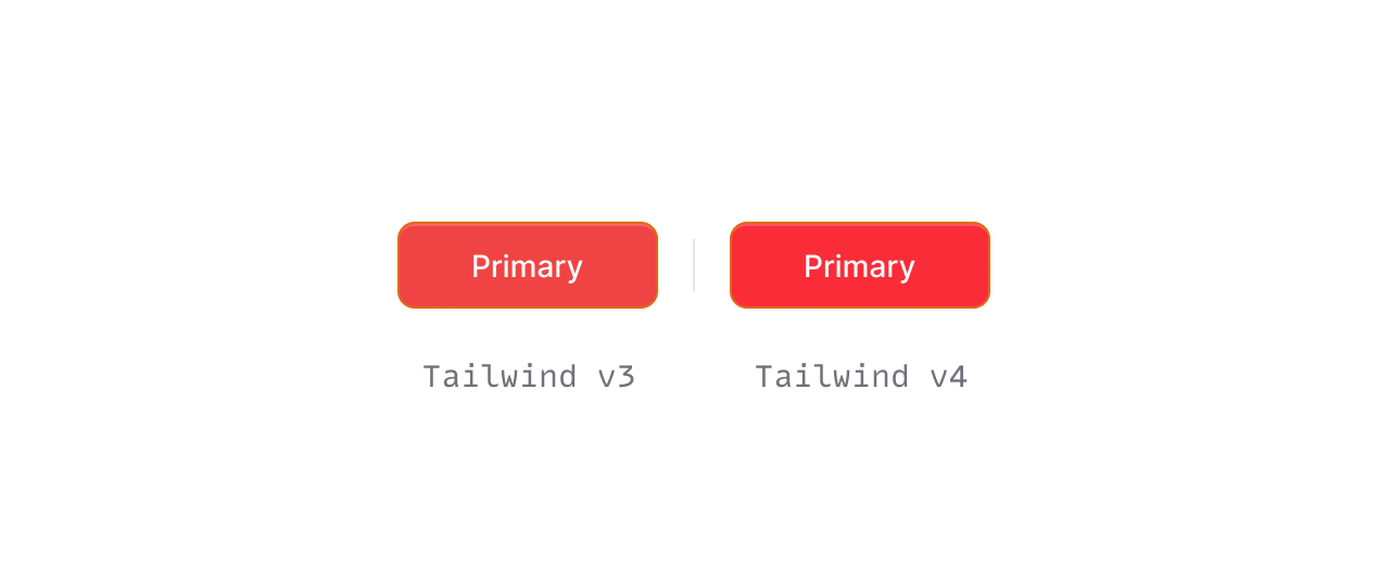
With Tailwind 4 right around the corner, we wanted to make sure we taking advantage of all the goodness it has to offer as well as using conventions like the aforementioned variable names.
Tailwind 4 uses a more modern color space for its color palette called oklab instead of the standard srgb (hsa(), rgb(), etc.) that you're used to.
Here is the difference between bg-red-500 in Tailwind 3 vs Tailwind 4:
Copy to clipboard
/* Tailwind 3 */--color-red-500: #ef4444;/* Tailwind 4 */--color-red-500: oklch(0.637 0.237 25.331);This unlocks an entire new level of color (on modern monitors) that we were previously unable to render.
Therefore, you'll notice all colors in Flux themes are more vibrant than anything you would have seen in Tailwind 3.
In the interim, we've copied every CSS color variable to Flux from Tailwind 4's public beta. When Tailwind 4 is released, we'll be able to drop these and just use the ones Tailwind ships with.
We've spent countless hours researching and experimenting with everything theme related and are very happy with where we've landed. We hope you are too.