The Changelog
What's new around here?
Succinct and informative updates about Flux.
February 17, 2025
Flux 2 is here
Version ^2.x
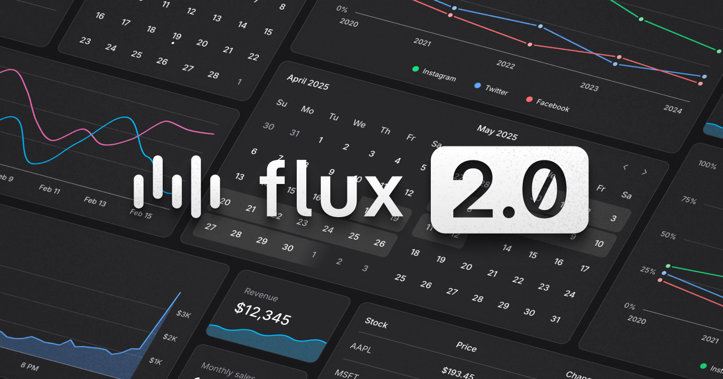
What started as a curiosity—building a date picker from scratch—turned into months of focused work dreaming and building the next version of Flux. Complete with date pickers, calendars, charts, and more.
Today, we're proud to release: Flux v2
Flux v2 brings powerful new components while staying lean and dependency-free. This release includes:
- A lightweight date picker & calendar
- Line & area charts for analytics
- Full Tailwind 4 support
- A free tier with essential UI components
- Laravel starter kits for instant productivity
Let's go.
Zero added dependencies
Keeping Flux lightweight was a top priority. Instead of pulling in third-party date pickers and charts, we built our own from the ground up—resulting in only 13kb added to the bundle.
Why go through all that trouble for a few extra kilobytes?
While exploring third-party charting and date picker libraries, we kept running into the following:
- Too much complex configuration
- Difficulty styling to match our designs
- Lack of accessibility & localization
With that, we decided to roll up our sleeves and build it all ourselves. And we're glad we did, because now we have the exact components we want for our use cases and nothing more. On top of that, when we encounter things we'd like added or modified in the future, we can just make it happen. No plugins, no pull requests, just changing our own code.
The date picker
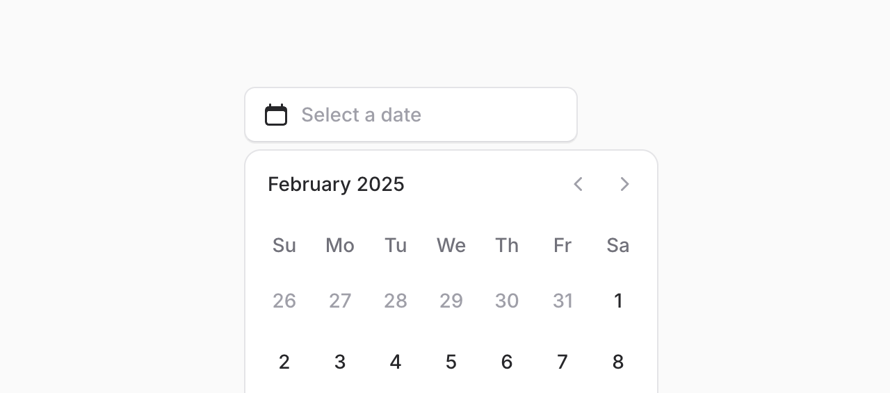
Date pickers are everywhere—but most libraries are bloated and hard to style. With Flux v2, adding a sleek, fully accessible date picker is as simple as:
Copy to clipboard
<flux:date-picker />Of course, like any component in Flux, we went the extra mile to make sure this component is:
- Mobile Friendly
- Keyboard accessible
- Internationalized
A calendar component
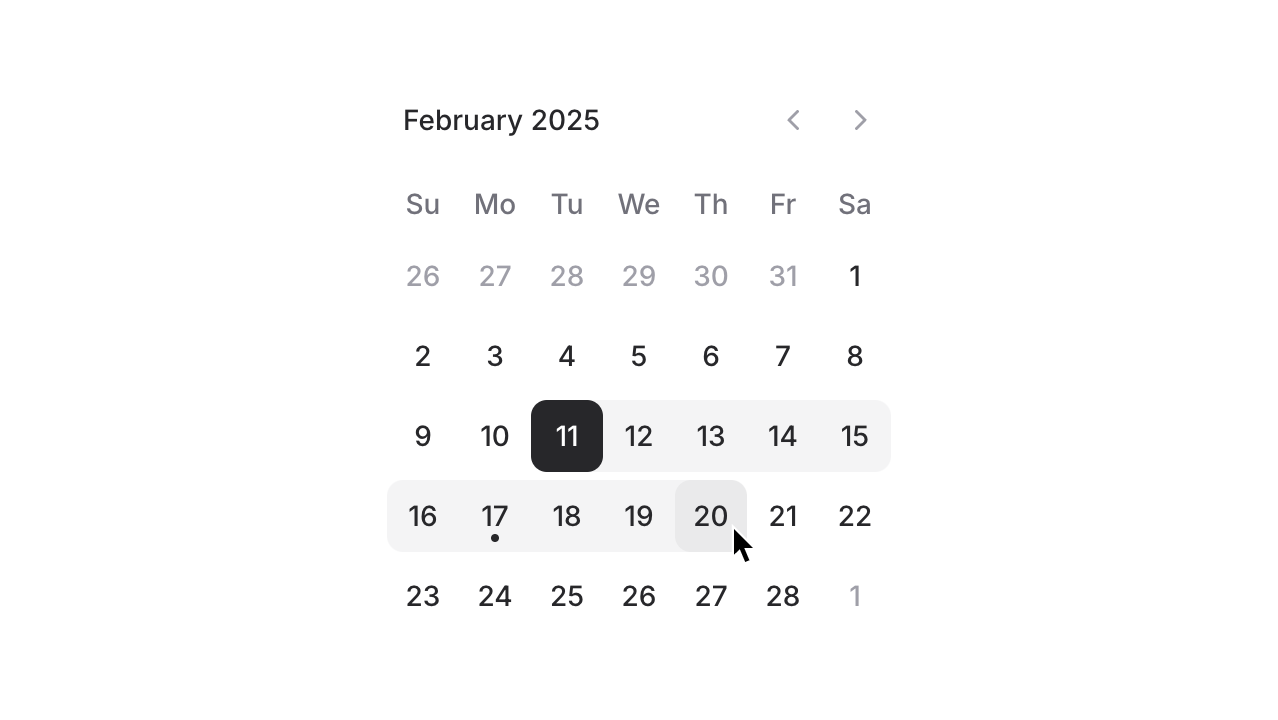
Date pickers are great, but sometimes you may want to embed the calendar itself on the page to allow users to choose a date for something like an appointment. We've seen this pattern a lot on sites like Shopify and AirBnB.
With our dedicated Calendar component you can now allow users to choose dates without hiding the calendar inside a dropdown:
Copy to clipboard
<flux:calendar />The date range picker
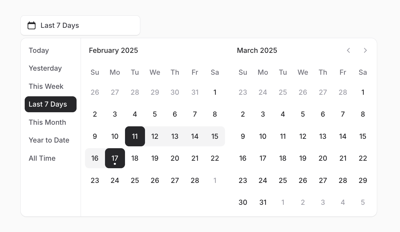
Date range pickers are an essential part of any analytics or booking interface. Therefore we didn't hold back when building ours.
You can simply add mode="range" to any date picker or calendar to support ranges, or you can go all out with presets, input fields, and plenty more options:
Copy to clipboard
<flux:date-picker mode="range" months="2" with-presets />Charts
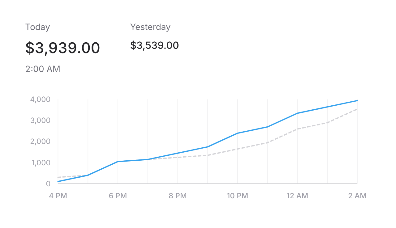
Just like the date picker, a charting library is something we never thought we'd build from scratch...but once we started playing around, we started seeing a vision for how we could do charting differently and had to see it through.
They’re Just SVGs
This library is unique in that it makes you feel like you’re simply building and styling an SVG yourself.
This means the syntax for building a chart is slightly more verbose than other Flux components, but the experience is incredible—you won’t feel like you’re learning a mountain of complex configuration schemas. Instead, it’ll feel like you’re just tinkering with some <div>s and Tailwind classes.
To demonstrate, take a look at the following "Sparkline" chart in Flux:
Here is the markup required to create the above chart:
Copy to clipboard
<flux:chart wire:model="data" class="min-h-32"> <flux:chart.svg> <flux:chart.line class="text-blue-500" stroke="currentColor" stroke-width="2" /> </flux:chart.svg></flux:chart>The above snippet renders, essentially, the following HTML:
Copy to clipboard
<div class="min-h-32"> <svg viewBox="..."> <path d="..." class="text-blue-500" stroke="currentColor" stroke-width="2" /> </svg></div>As you can see, each chart component maps directly to an HTML or SVG element. This means have FULL control over how your chart looks and how it's rendered.
Of course you can copy and paste our charting examples from the docs if you just want to get up and running, but after becoming familiar with the API, you'll have full control to do whatever you want.
Composable
One of my favorite things about this charting tool is its composability. You can mix and match different chart components to create exactly what your app demands.
For example, consider the following code:
Copy to clipboard
<!-- Line on top --><flux:chart.area class="text-blue-500/50" /><flux:chart.line class="text-blue-500" /><!-- Area on top --><flux:chart.line class="text-blue-500" /><flux:chart.area class="text-blue-500/50" />Rendering order is intuitive—just like stacking divs. Whatever appears last will be drawn on top.
Because most of our chart components are actually rendering SVG markup, you can control things intuitively that would have otherwise been an entirely separate configuration item.
Tailwind 4
Tailwind 4 simplifies configuration by allowing customization directly in CSS. Flux takes advantage of this to include its own styles and default configuration effortlessly:
Copy to clipboard
@import 'tailwindcss';@import '../../vendor/livewire/flux/dist/flux.css';This feels much lighter and cleaner to us than the previous approach in Flux v1: A @fluxStyles directive along with additional configuration in tailwind.config.js.
Of course, there are heaps of other goodies in Tailwind 4 that compelled us to switch.
One teeny tiny example is not needing square brackets when styling elements based on data attributes (a pattern we use A LOT):
Copy to clipboard
<!-- Tailwind 3: --><div class="data-[checked]:bg-zinc-800"><!-- Tailwind 4: --><div class="data-checked:bg-zinc-800">Improved dark mode control
For dark mode to work in Flux, a .dark class needs to be added and removed from your app's <html> element.
Rather than doing this yourself in v1, Flux handled this automatically for you.
However, we've heard from users that, although that's nice most of the time, sometimes you want full control over your dark mode setup.
Therefore, in v2, we've removed our automatic handling of dark mode in favor of a new dedicated attribute called @fluxAppearance:
Copy to clipboard
... @fluxAppearance</head>Now, you can easily disable dark mode in your app entirely by simply not including this directive.
Or, if you want to control the .dark class based on something like server-side database code, you can do so yourself freely as well.
Laravel starter kits + new free tier
Flux is now officially part of Laravel’s new starter kits launching next week!
To make this possible, we've beefed up our free tier by including all the essentials you need in a basic web app. Things like buttons, modals, dropdowns, form inputs, etc.
The rest of Flux's more advanced and capable components will be separated out into a dedicated Pro tier.
Of course, all previous purchases will be grandfathered into the pro tier.
Livewire has always been an incredibly productive way to write web apps, but the front-end component landscape just wasn't up to par. Flux has been our mission to resolve this disparity, and now with Flux 2 we feel like the foundation is set.
And we’re just getting started—tons of new components and templates are coming soon. Stay tuned!
-Caleb