The Changelog
What's new around here?
Succinct and informative updates about Flux.
October 21, 2024
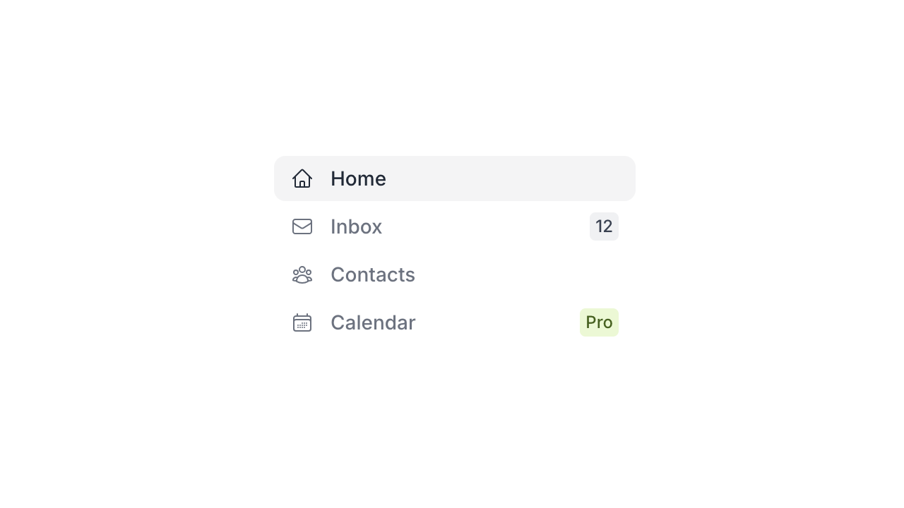
Customize navigation badge colors

You can now customize the color of navigation badges using the badge-color property:
Copy to clipboard
<flux:navlist.item badge="Pro" badge-color="lime"> Calendar</flux:navlist.item>Modal close listeners
You can now run any Livewire action when a Flux modal closes for any reason—escape, cancel, close button, etc.
Copy to clipboard
<flux:modal @close="someLivewireAction"> <!-- ... --></flux:modal>Fuzzier searchable selects
All searchable inputs in Flux—searchable selects, comboboxes, command palettes—will now use JavaScript .includes(...) instead of .startsWith(...) when matching results so that searches are more inclusive.
This behavior mirrors the browser's native autocomplete behavior for the <datalist> element.

- Support @close listeners on modal component
- Add badge-color property to navlist and navbar
- Use .includes() instead of .startsWith() for autocomplete/combobox/command search
- Fix listbox/combobox not showing newly selected option if added dynamically
- Make accordion heading text full-width
- Silence error when non-valid colors are passed to badge component
- Prevent radio/checkbox group labels from being grayed out if individual controls are disabled
- Expose slots for select button and input in listbox/combobox
- Make select full-width and forward classes to the <ui-selected> element instead of the <button> element
- Polyfill the popover attribute for Safari 16 and lower
- Provide fallbacks for unsupported CSS in older browsers
- Disable modal triggering on disabled buttons