The Changelog
What's new around here?
Succinct and informative updates about Flux.
RSS feed
November 13, 2024
Multi-selects
Version ^1.0.23
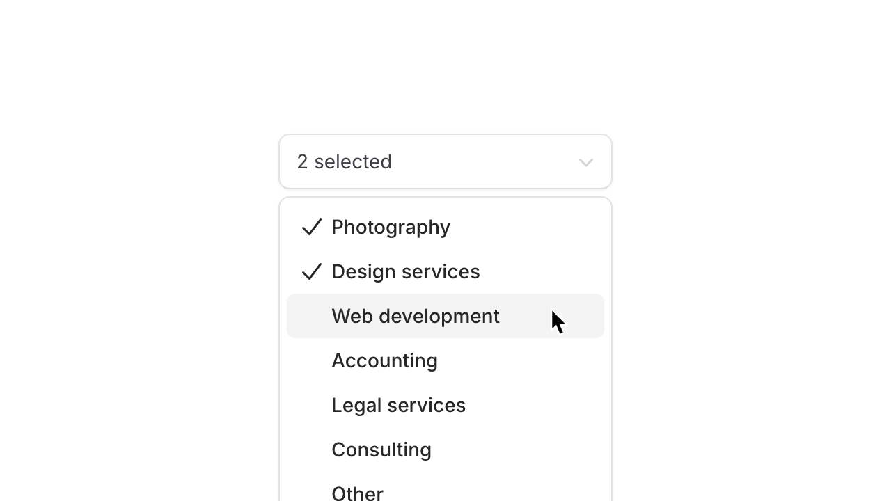
We held off on releasing multi-selects at launch because we felt like there were too many decisions to get right, but here we are. In Flux version 1.0.23 and above, you are now able to pass the multiple prop and turn a single-select into a multi-select:
Copy to clipboard
<flux:select variant="listbox" multiple> <flux:option>Photography</flux:option> ...</flux:select>Of course, data binding works as you'd expect, by passing the name of a Livewire property into wire:model, Livewire will keep the state of that property in sync with your selections:
Copy to clipboard
<flux:select wire:model="selected" variant="listbox" multiple>
Copy to clipboard
<?phpclass extends Livewire\Component{ public $selected = []; ...}We have big plans for the future of multi-select, like adding new variants for selecting pills, tags, avatars, etc., but for now, this is a good start.
Custom selected suffix

After your first selection, Flux shows the number of items selected, followed by the word "selected".
If you want to customize this to make it more contextual, you can do so using the selected-suffix prop:
Copy to clipboard
<flux:select selected-suffix="industries selected" variant="listbox" multiple>Checkbox indicator
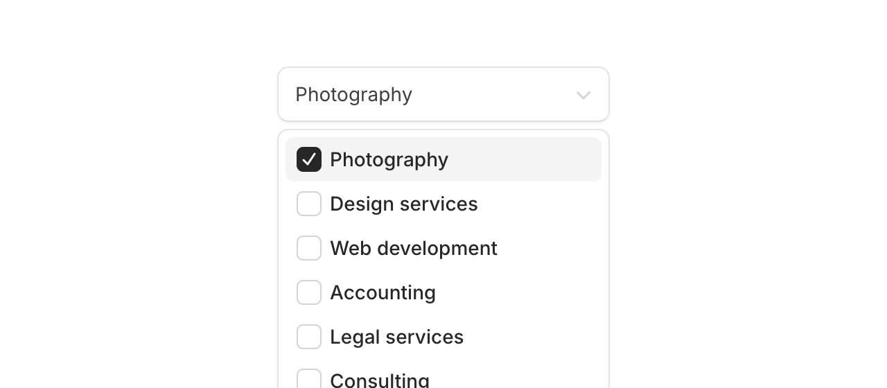
The default check mark icon is now configurable for multi-selects. If you want a checkbox visual indicator instead, you can use the new indicator prop:
Copy to clipboard
<flux:select indicator="checkbox" variant="listbox" multiple>- Support for multi-selects
- Dispatch input events when select listbox clearable button is clicked so that wire:model.live picks up the change
November 3, 2024
Custom icon sets, file inputs, click outside modals, & more
Version ^1.0.20

Flux ships with the entire Heroicons icon set by default. As with anything the Tailwind folks do, it's excellent.
However, at ~400 icons, it's more limited than other alternatives.
If there's an icon in your project that you need but isn't available in Heroicons, it's probably available in Lucide.
In version v1.0.20 of Flux, we've shipped a new command to easily import individual Lucide icons into your project:
Copy to clipboard
php artisan flux:iconYou will be prompted to enter the names of any icons you want, and it will import them locally into your project and format them as Blade components ready to use with Flux.
If Lucide doesn't have what you need still, you can just add your icons manually to the following directory in your project:
Copy to clipboard
resources/views/flux/icon/your-custom-icon.blade.phpCustom file input
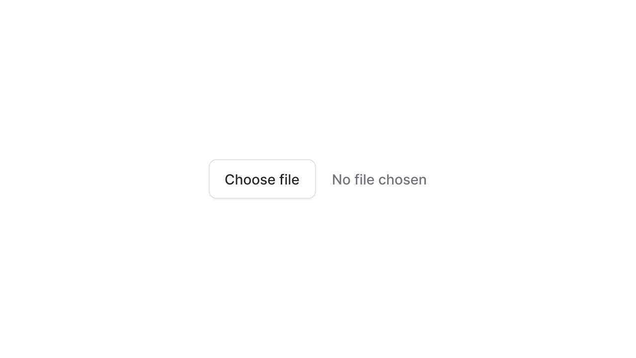
The browser's default file input element is unstylable and frankly, looks outdated.
We've added our own simple wrapper around the native file input and exposed it through type="file" on the input component:
Copy to clipboard
<flux:input type="file" />Of course, we made sure our wrapper works just as well with both the keyboard, mouse, and screen readers as the native input does.
Closing modals by clicking outside
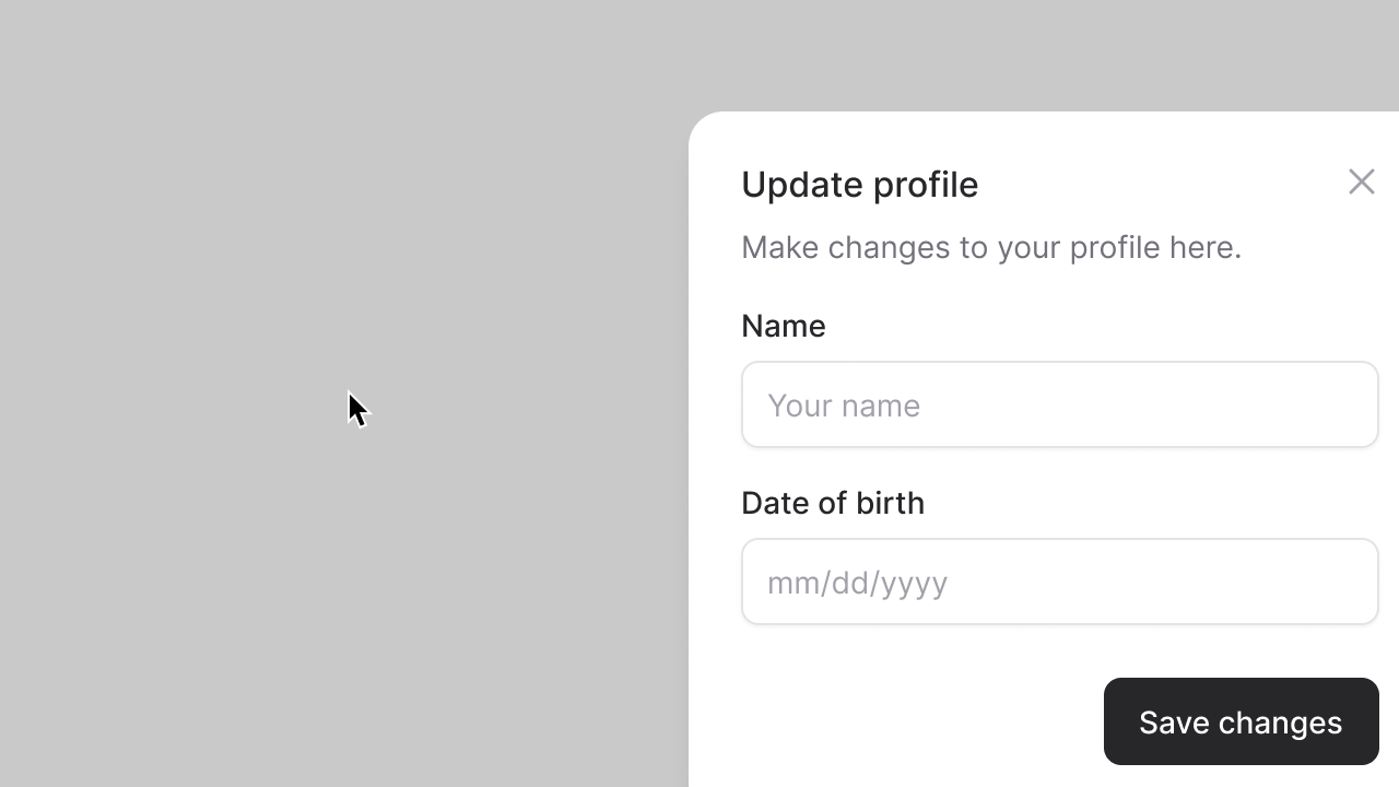
Flux uses the browser's new(ish) <dialog> element for its modals. There tons of benefits to this, but also a few quirks. One of them being, the <dialog> element doesn't respond to clicking outside to close a modal; only the escape key or a close button.
With a sprinkle of custom JavaScript, it was fairly trivial to implement this behavior in Flux. Now, by default, all <flux:modal> components will close on click outside.
Clearable inputs and selects

Another small improvement we made in this release was making any searchable input in Flux show a clear button when filled.
We've also made this configurable for inputs that don't show one by default:
Copy to clipboard
<flux:input clearable /><flux:select variant="listbox" clearable> ...</flux:select><flux:command> <flux:command.input placeholder="Search..." /> ...</flux:command- Add flux:icon command to import third-party icons from Lucide for icons Heroicons is missing
- Support clearable buttons on listbox, searchable input, and command input
- Swap deprecated 'color-adjust' CSS property for 'print-color-adjust'
- Fix profile name not being truncated in sidebar layout
- Fix wire:model bugs on checkbox, radios, and switches due to errant input/change events being fired
- Fix dynamic-component bug where attributes are double escaped
- Fix checkbox group using an initial value of null
- Preserve selected display event when selected option element is removed
- Support closing modals by clicking outside
- Add custom file input component
October 31, 2024
Radio cards have landed
Version ^1.0.19
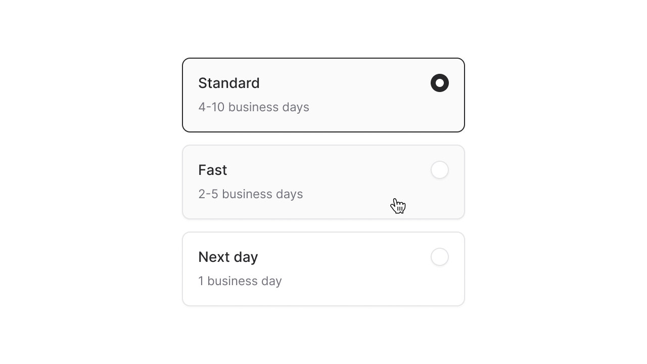
You know those big boxy toggle thingy's you use to configure your new laptop purchase? Yep, those are radio cards; simple, bordered boxes that behave like radio buttons—meaning only one can be selected at a time.
Welp, we've got em' in Flux now, and using them is as simple as adding variant="cards" to a radio group:
Copy to clipboard
<flux:radio.group wire:model="shipping" variant="cards"> <flux:radio value="standard" label="Standard" description="4-10 business days" /> ...</flux:radio.group>By default, the cards will be laid out horizontally, but you can easily control this using simple flex box utilities like .flex-col. This makes it really easy to change the layout on mobile with a responsive utility like .max-sm:flex-col:
Copy to clipboard
<flux:radio.group variant="cards" class="max-sm:flex-col">Adding a cube icon to a card is as simple as passing an icon="cube" prop:
Copy to clipboard
<flux:radio icon="cube" ... />
If you want cleaner looking cards, you can remove the radio indicator by passing :indicator="false" into the radio group.
Copy to clipboard
<flux:radio.group variant="cards" :indicator="false"> ...</flux:radio.group>
For most cases, this level of customization is enough, but still, there might be times where you need full control over the contents of each card.
If that's the case, you can compose these radio cards your self with the full-form syntax:
Copy to clipboard
<flux:radio.group variant="cards"> <flux:radio> <div> <flux:heading>Standard</flux:heading> <flux:subheading size="sm">4-10 business days</flux:subheading> </div> <flux:radio.indicator /> </flux:radio></flux:radio.group>Although less common, there might be times you want the appearance of cards, but the behavior of checkboxes. Flux also supports variant="cards" for checkboxes:
Copy to clipboard
<flux:checkbox.group variant="cards"> <flux:checkbox label="Newsletter" description="Stay up to date" /> ...</flux:checkbox.group>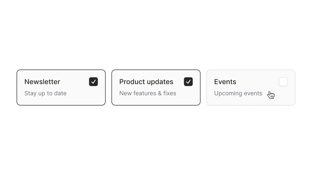
Of course, all of the aforementioned properties and customizations are available to checkbox cards as well.
While we were adding new radio variants, we decided to add another commonly requested one: Segmented radio buttons.
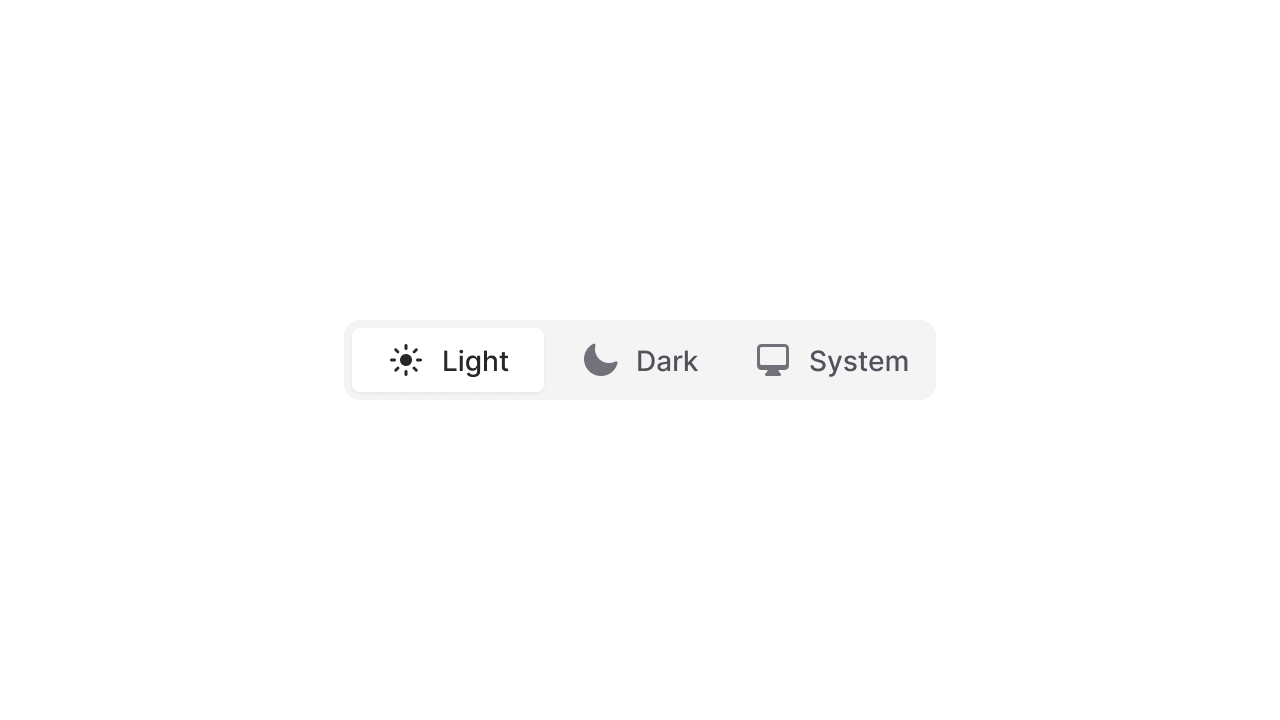
Just like cards, you can use segmented buttons with the variant="segmented" prop:
Copy to clipboard
<flux:radio.group variant="segmented"> <flux:radio label="Light" icon="sun" /> <flux:radio label="Dark" icon="moon" /> <flux:radio label="System" icon="computer-desktop" /></flux:radio.group>Creating radio and checkbox variants like these is much more than just visuals. Each of these is fully controllable with a keyboard, uses a roving-tabindex to mimic the focus behavior of native checkboxes and radio buttons, and supports the proper attributes and roles so that screenreaders recognize these as standard form controls.
These are among the many details that differentiate Flux among other component libraries. We care deeply about providing world-class UI components that look amazing in the browser, feel amazing in your editor, and are accessible to as many people as possible.
- Add radio cards variant
- Add checkbox cards variant
- Add segmented radio group variant
- Change to solid icons for segmented tabs and radios
- Add two pixel focus outline offset to radio, checkbox, and switch to match native outlines
- Sortable column backgrounds were getting cut off on mobile
- Translate "No results found" strings in combobox and listbox
- :href properties were being escaped, causing links with ampersands to be malformed
- Support as="div" to render a button as a div