The Changelog
What's new around here?
Succinct and informative updates about Flux.
June 16, 2025
Pills & button selectors
Version ^2.2.0
We've added two new variants to the radio and checkbox components: pills and buttons.
These variants work with both radio groups and checkbox groups, giving you compact alternatives that fit perfectly in filters, toolbars, and anywhere you want a more streamlined look.
Pills
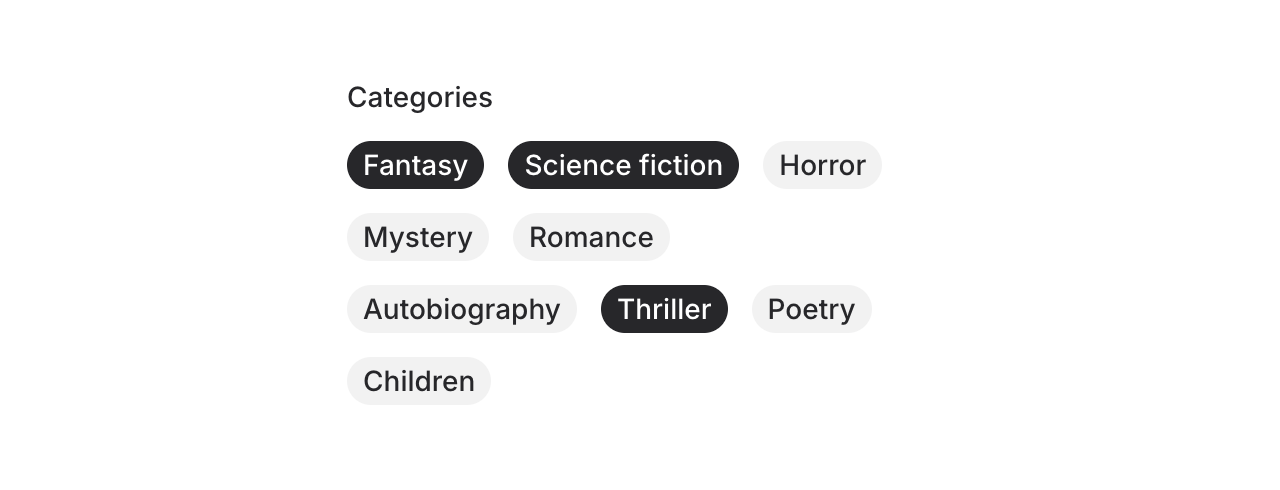
Pills are compact, rounded buttons that look like…well…pills! They're perfect for laying out selectable options in a way that doesn't dominate the UI.
Copy to clipboard
<flux:checkbox.group variant="pills" label="Categories"> <flux:checkbox value="fantasy" label="Fantasy" /> <flux:checkbox value="science-fiction" label="Science fiction" /> <flux:checkbox value="horror" label="Horror" /> <!-- ... --></flux:checkbox.group>Of course, pills work just as well with the radio.group component if you only want them to be single-select.
Selectable buttons
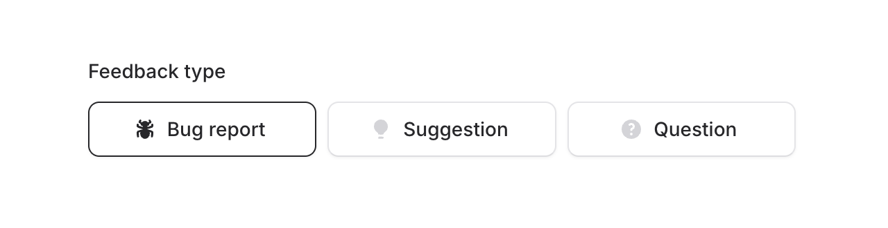
The buttons variant gives you toolbar-style options that look more prominent and actionable. Perfect for feature toggles and grouped controls:
Copy to clipboard
<flux:radio.group variant="buttons" label="Feedback type"> <flux:radio icon="bug-ant">Bug report</flux:radio> <flux:radio icon="light-bulb">Suggestion</flux:radio> <flux:radio icon="question-mark-circle">Question</flux:radio></flux:radio.group>Like all Flux components, these variants are fully keyboard accessible with proper focus management and screen reader support. The pills flow nicely and wrap to new lines when needed, while the buttons maintain consistent sizing and alignment.
Both variants support all the same props as the standard radio and checkbox components—icons, disabled states, and more.