The Changelog
What's new around here?
Succinct and informative updates about Flux.
November 26, 2025
Kanban
Version ^2.9.0
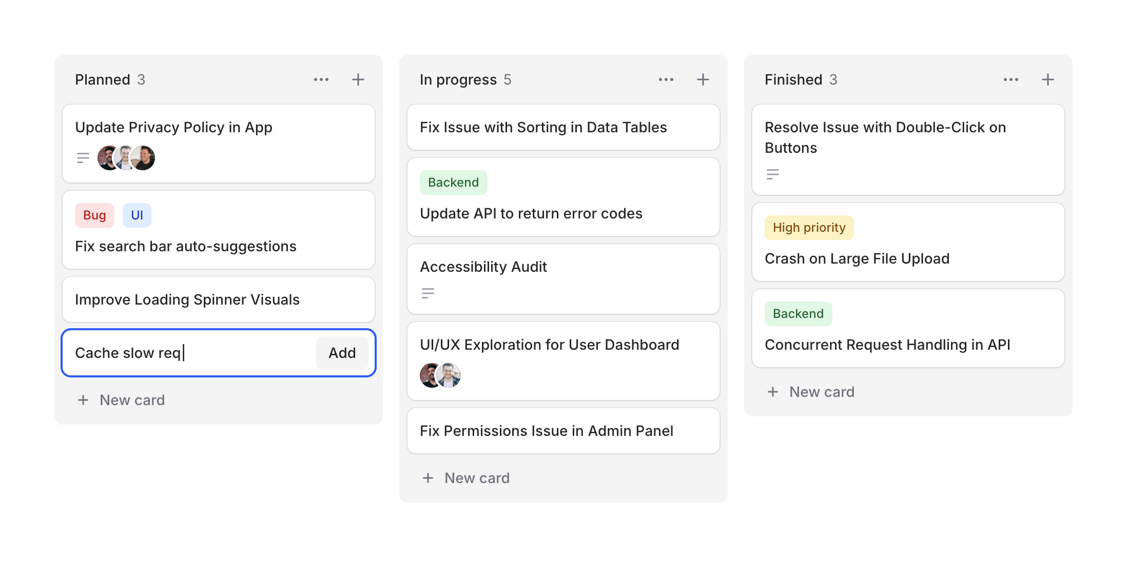
Project management, task tracking, workflow visualization—kanban boards are everywhere. Designing them from scratch can be tedious, so we figured Flux should make it easy.
Cheeck out our new Kanban system, a collection of components for building beautiful workflow boards. Take a look.
Copy to clipboard
<flux:kanban> @foreach ($columns as $column) <flux:kanban.column> <flux:kanban.column.header :heading="$column->title" :count="count($column->cards)" /> <flux:kanban.column.cards> @foreach ($column->cards as $card) <flux:kanban.card :heading="$card->title" /> @endforeach </flux:kanban.column.cards> </flux:kanban.column> @endforeach</flux:kanban>Column arrangements
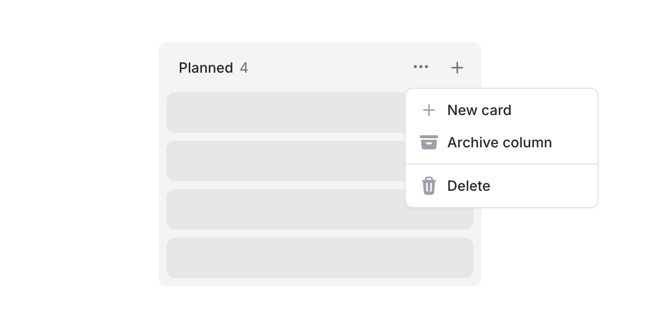
Columns support headings, counts, and action slots. Add dropdowns for column management or quick-add buttons:
Copy to clipboard
<flux:kanban.column.header heading="In Progress" count="5"> <x-slot name="actions"> <flux:dropdown> <flux:button variant="subtle" icon="ellipsis-horizontal" size="sm" /> <flux:menu> <flux:menu.item icon="plus">New card</flux:menu.item> <!-- ... --> </flux:menu> </flux:dropdown> <flux:button variant="subtle" icon="plus" size="sm" /> </x-slot></flux:kanban.column.header>Flexible cards
Cards are composable with header and footer slots for maximum flexibility.
Card headers
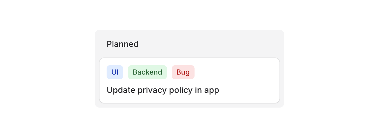
Use the header slot for badges, tags, or labels:
Copy to clipboard
<flux:kanban.card heading="Update privacy policy"> <x-slot name="header"> <div class="flex gap-2"> <flux:badge color="blue" size="sm">UI</flux:badge> <flux:badge color="green" size="sm">Backend</flux:badge> <flux:badge color="red" size="sm">Bug</flux:badge> </div> </x-slot></flux:kanban.card>Card footers
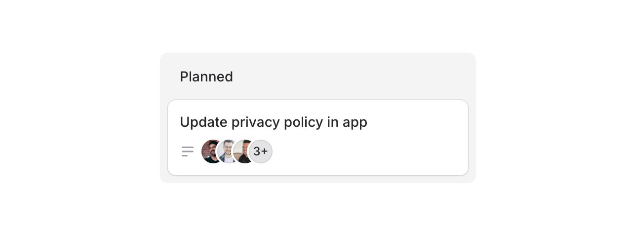
Use the footer slot for avatars, icons, or metadata:
Copy to clipboard
<flux:kanban.card heading="Update privacy policy"> <x-slot name="footer"> <flux:icon name="bars-3-bottom-left" variant="micro" class="text-zinc-400" /> <flux:avatar.group> <flux:avatar circle size="xs" src="..." /> <!-- ... --> </flux:avatar.group> </x-slot></flux:kanban.card>Cards can also be made clickable with as="button" to open modals or detail views:
Copy to clipboard
<flux:kanban.card as="button" wire:click="edit({{ $card->id }})" heading="{{ $card->title }}"> <!-- ... --></flux:kanban.card>Drag & drop
Flux doesn't ship with drag-and-drop features, but you can add them using Alpine's x-sort plugin or preferably wire:sort in Livewire 4 (currently in beta):
Copy to clipboard
<flux:kanban wire:sort="moveColumn"> @foreach ($columns as $column) <flux:kanban.column :wire:key="$column->id" :wire:sort:item="$column->id" > <flux:kanban.column.header :heading="$column->title" :count="count($column->cards)" /> <flux:kanban.column.cards wire:sort="moveCards"> @foreach ($column->cards as $card) <flux:kanban.card :heading="$card->title" :wire:key="$card->id" :wire:sort:item="$card->id" /> @endforeach </flux:kanban.column.cards> </flux:kanban.column> @endforeach</flux:kanban>Check out the Kanban documentation for more examples and the full API reference.
November 26, 2025
Skeleton
Version ^2.9.0

Loading states matter. A well-designed skeleton keeps users engaged while content loads, making your app feel faster and more polished.
Introducing Skeleton, a flexible component for creating placeholder content.
Copy to clipboard
<flux:skeleton.group animate="shimmer" class="flex items-center gap-4"> <flux:skeleton class="size-10 rounded-full" /> <div class="flex-1"> <flux:skeleton.line /> <flux:skeleton.line class="w-1/2" /> </div></flux:skeleton.group>Text placeholders

The skeleton.line component mimics real text—it occupies the full line-height but renders a slimmer bar, giving it the natural proportions of actual text:
Copy to clipboard
<flux:skeleton.group> <flux:skeleton.line class="mb-2 w-1/4" /> <flux:skeleton.line /> <flux:skeleton.line /> <flux:skeleton.line class="w-3/4" /></flux:skeleton.group>Animation options

Choose between shimmer and pulse animations, or go with no animation at all. The skeleton.group component lets you set the animation once and have all child skeletons inherit it:
Copy to clipboard
<!-- Shimmer animation --><flux:skeleton.group animate="shimmer"> <flux:skeleton.line /></flux:skeleton.group><!-- Pulse animation --><flux:skeleton.group animate="pulse"> <flux:skeleton.line /></flux:skeleton.group><!-- No animation --><flux:skeleton.line />Real-world examples
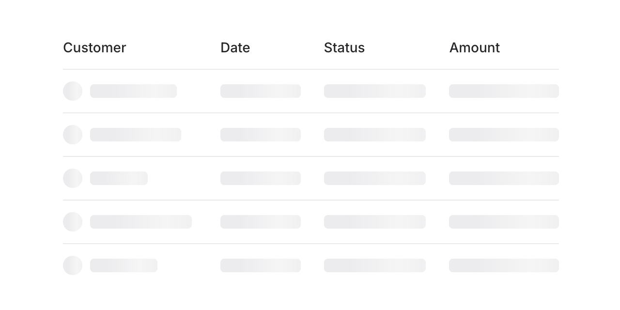
Build skeleton states for anything—tables, cards, charts, profiles. Here's a table loading state:
Copy to clipboard
<flux:skeleton.group animate="shimmer"> <flux:table> <flux:table.columns> <flux:table.column>Customer</flux:table.column> <flux:table.column>Date</flux:table.column> <flux:table.column>Status</flux:table.column> </flux:table.columns> <flux:table.rows> @foreach (range(1, 5) as $i) <flux:table.row> <flux:table.cell> <div class="flex items-center gap-2"> <flux:skeleton class="rounded-full size-5" /> <flux:skeleton.line /> </div> </flux:table.cell> <flux:table.cell> <flux:skeleton.line /> </flux:table.cell> <flux:table.cell> <flux:skeleton.line /> </flux:table.cell> </flux:table.row> @endforeach </flux:table.rows> </flux:table></flux:skeleton.group>Check out the Skeleton documentation for more examples and the full API reference.
November 25, 2025
Slider
Version ^2.8.0

Whether you're building a price filter, adjusting settings, or selecting a range of values, sliders are a natural fit for countless interfaces. Flux now ships with a fully-featured Slider component.
Let's take a look.
Copy to clipboard
<flux:slider wire:model="employees" />Range selection

Need to select a range instead of a single value? Add the range prop and you get two thumbs—perfect for price ranges, date ranges, or any min/max filtering.
Copy to clipboard
<flux:slider range wire:model="budget" />Bind to an array in your Livewire component and both values update in real-time:
Copy to clipboard
public array $range = [200, 800];Fine-tuned control
Configure the slider exactly how you need it with min, max, step, and min-steps-between:
Copy to clipboard
<flux:slider range min="0" max="1000" step="10" min-steps-between="10"/>The min-steps-between prop ensures your range thumbs maintain a minimum distance—so if your step is 10 and min-steps-between is 10, the thumbs will always be at least 100 units apart.
Visual markers

Add ticks below the slider to help users visualize steps and values. Show simple marks, numbers, or custom labels:
Copy to clipboard
<!-- Simple tick marks --><flux:slider min="1" max="5"> @foreach (range(1, 5) as $i) <flux:slider.tick :value="$i" /> @endforeach</flux:slider><!-- With numbers --><flux:slider min="1" max="5"> @foreach (range(1, 5) as $i) <flux:slider.tick :value="$i">{{ $i }}</flux:slider.tick> @endforeach</flux:slider><!-- Custom labels --><flux:slider min="1" max="5"> <flux:slider.tick value="1">Low</flux:slider.tick> <flux:slider.tick value="3">Mid</flux:slider.tick> <flux:slider.tick value="5">High</flux:slider.tick></flux:slider>Custom styling

Make it your own with track:class and thumb:class. Want a chunkier slider? No problem:
Copy to clipboard
<flux:slider track:class="h-3 bg-blue-600" thumb:class="size-5" />These props give you complete control over the appearance while keeping all the functionality intact.
The details that matter
We really sweat the details on this one and hope it shows.
Offset mouse tracking: When you click to drag a thumb, it doesn't snap the center of the thumb to your cursor—making precise adjustments feel natural and accurate, especially when moving just a step or two.
Intelligent thumb behavior: In range mode, the thumbs can't cross over each other and invert the range. The right thumb always stays on top when they're close together, preventing any confusion about which is which.
Big steps: Hold Shift while pressing arrow keys to jump by larger increments using the big-step prop—great for quickly covering large ranges.
Accessibility
And of course, we went to great lengths to make sure this component honors expected keyboard navigation, proper focus indicators, and appropriate ARIA labels so that screen readers can use it just as well. Arrow keys adjust values, and you can tab between thumbs in a range slider.
Check out the Slider documentation for more examples and the full API reference.