The Changelog
What's new around here?
Succinct and informative updates about Flux.
September 15, 2025
Pillbox
Version ^2.4.0
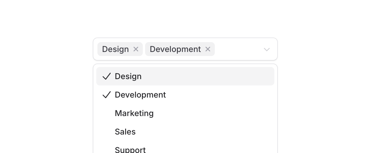
Introducing Pillbox, a select component that displays selected items as removable pills right inside the input area. Perfect for tagging systems, skill selectors, or any multi-select scenario where you want selected values to be front and center.
Unlike traditional multi-selects that hide selections in a dropdown, Pillbox shows everything at a glance with each selection becoming a removable pill that expands the input area as needed.
Copy to clipboard
<flux:pillbox wire:model="tags" multiple placeholder="Choose tags..."> <flux:pillbox.option value="design">Design</flux:pillbox.option> <flux:pillbox.option value="development">Development</flux:pillbox.option> <flux:pillbox.option value="marketing">Marketing</flux:pillbox.option></flux:pillbox>Search through options
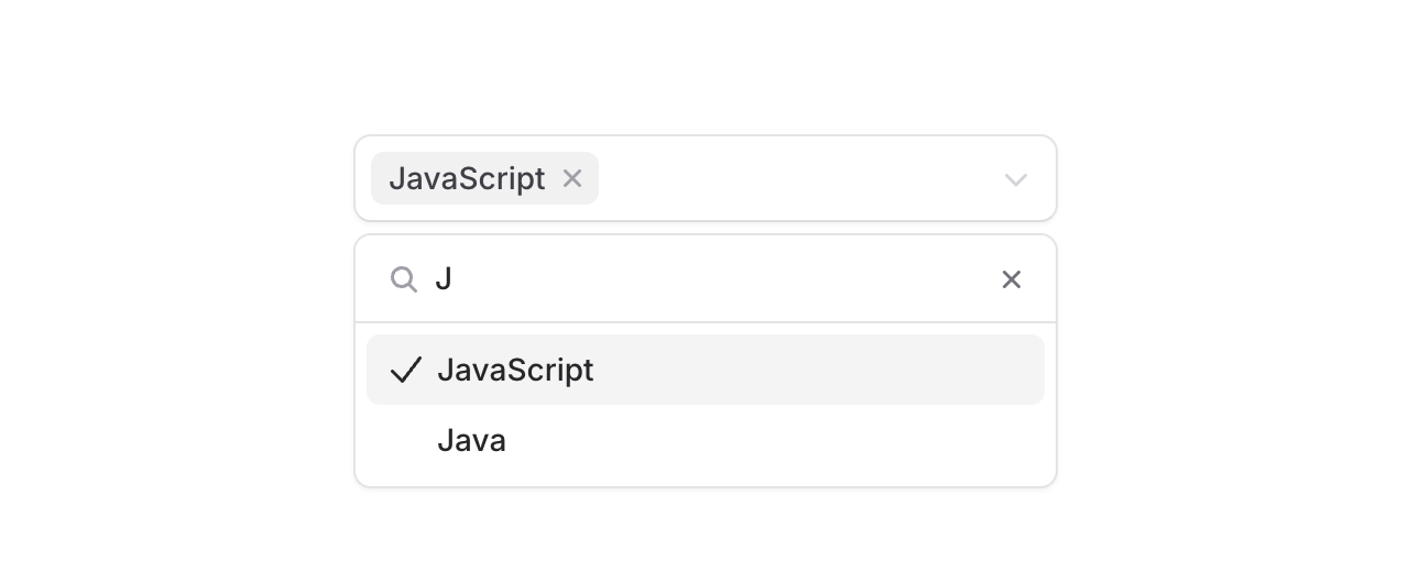
Add the searchable prop to filter through large lists. The search input appears right in the dropdown, making it easy to find exactly what you're looking for.
Copy to clipboard
<flux:pillbox multiple searchable placeholder="Choose skills..."> <flux:pillbox.option value="javascript">JavaScript</flux:pillbox.option> <flux:pillbox.option value="typescript">TypeScript</flux:pillbox.option> <flux:pillbox.option value="php">PHP</flux:pillbox.option> <!-- ... --></flux:pillbox>The details
We built Pillbox to handle the real-world complexity of multi-select inputs:
Visual feedback: Each pill has its own remove button, making it clear how to deselect individual items. The input area expands naturally as you add more pills.
Accessible by default: Screen readers announce selected items, available options, and state changes. ARIA attributes are handled automatically.
Custom content: Options aren't limited to text. Add icons or custom HTML to make options more recognizable.