# Item
Published: November 19, 2026
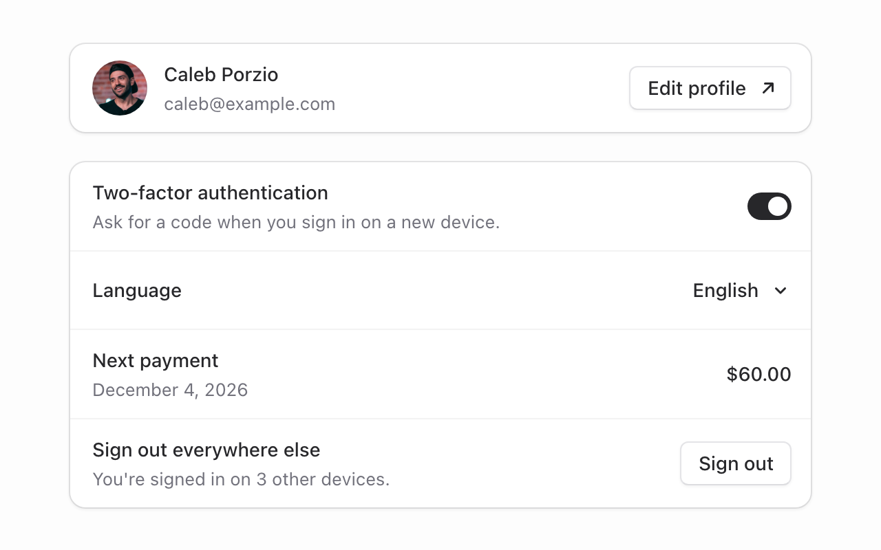 Meet **Item**: a row with a heading, a line of supporting text, and a control at the end.
It's the row you've built a hundred times for settings pages, account details, billing screens, and team lists. Now it's one component, with the alignment and spacing already worked out.
```blade
Two-factor authentication
Ask for a code when you sign in on a new device.
```
## Group them up
Wrap items in `flux:item.group` and they share one bordered surface, with a faint rule between each row:
```blade
...
...
...
```
The surface matches a default card, so groups sit comfortably next to the [new Card](/blog/2026-09-28-card). And a lone item draws that same surface itself. No wrapper needed.
## Anything at the end
`flux:item.actions` takes buttons, a switch, a dropdown, a badge, or just a value. It sits at the end of the row, centered on the heading and subheading no matter how tall either side gets. Put several things in there and they sit side by side.
```blade
Next payment
December 4, 2026
$60.00
```
The subheading is optional. Without one, an item is a single line that's still as tall as a small button, so a row with a switch and a row with just a value stay even in the same group.
## Lead with media
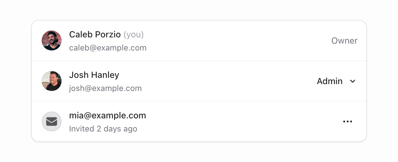 Put an avatar, an icon, or anything else in `flux:item.media` to lead the row. It's centered on the text beside it, with the spacing already set:
```blade
Josh Hanley
josh@example.com
Admin
...
```
## Fits wherever you put it
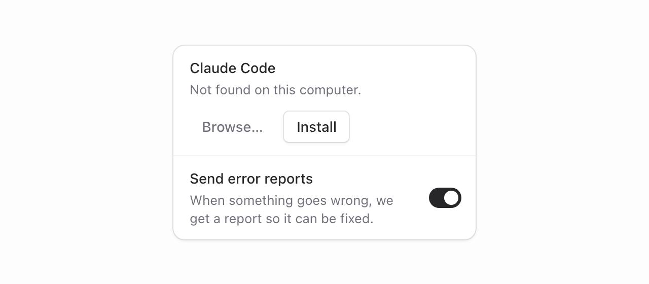 On a narrow item, a labeled button moves under the text so the heading keeps its room. Switches, values, menus, and icon buttons are compact enough to stay at the end of the row.
The item goes by its own width, not the screen's. It's a container query under the hood, so the same markup does the right thing on a phone, in a modal, or tucked into a sidebar.
## All. The. Details.
**Long text wraps**: Long words and email addresses break onto the next line instead of running under the actions.
**Real headings**: Pass `level` to `flux:item.heading` to render an actual `h2`, `h3`, and so on, so your page outline stays meaningful.
**Ready-made examples**: The docs include copy-and-paste examples for team members, connected apps, billing, notifications, and a danger zone.
And of course, Item is built from plain, semantic markup. The controls you put inside it, like switches, buttons, and dropdowns, keep all of their keyboard navigation, focus behavior, and screen reader support.
Item is part of free Flux, available in **v2.22.0**.
---
[Check out the item docs →](https://fluxui.dev/components/item)