# Card
Published: September 28, 2026
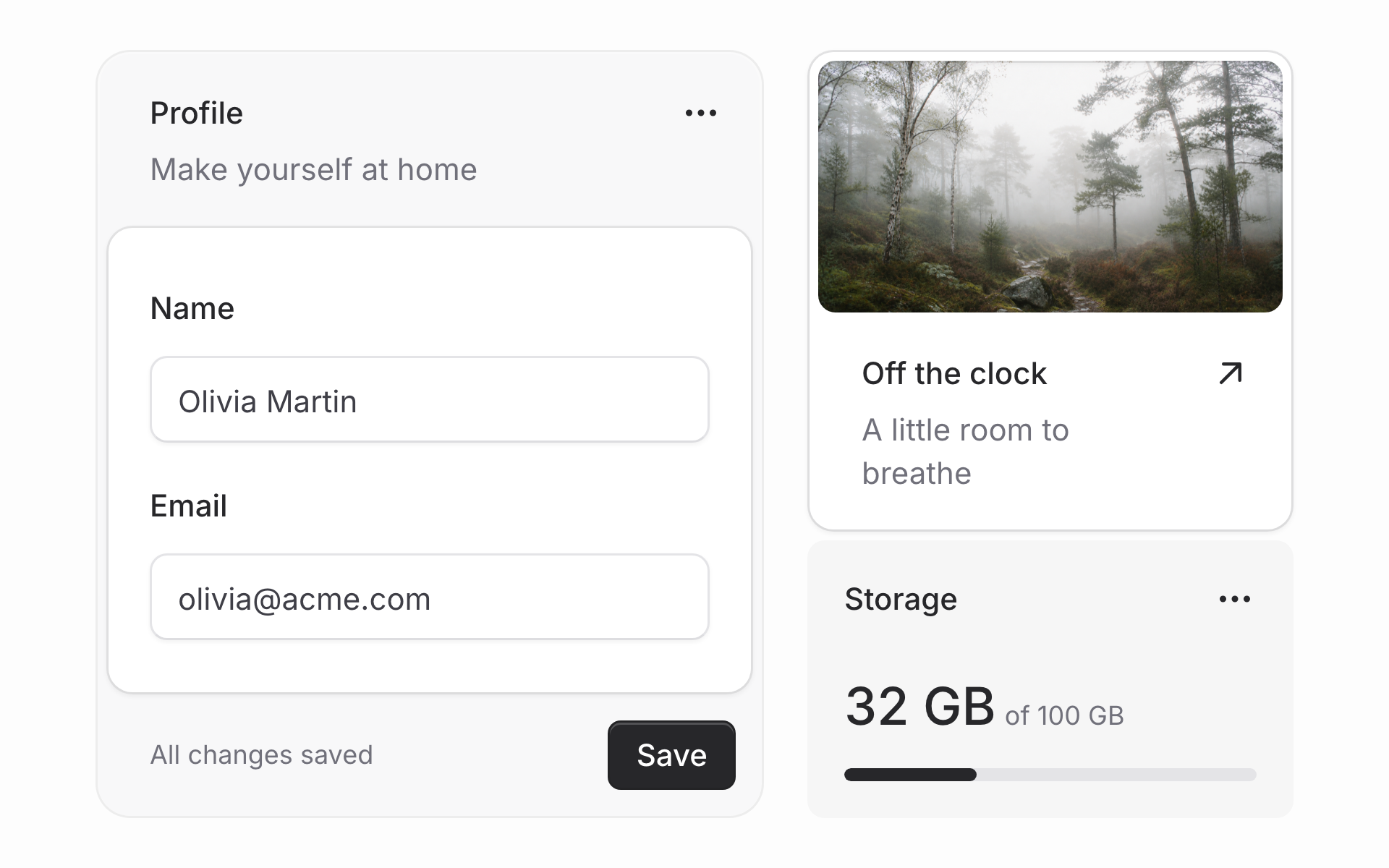 We've rebuilt Flux's **Card** to give your app beautifully aligned cards, with the spacing, surfaces, and corners already figured out.
We're proud of the details in this one. Buttons sit just right in headers, inner corners follow outer curves, and each layout gets its own carefully tuned spacing.
Compose a card from headers, bodies, and footers, and those details come with it:
```blade
Notifications
Choose what you hear about
```
Every part is optional. Use only the pieces a card needs, or put content straight inside and it's padded evenly.
## Surfaces
We've rebuilt Flux's **Card** to give your app beautifully aligned cards, with the spacing, surfaces, and corners already figured out.
We're proud of the details in this one. Buttons sit just right in headers, inner corners follow outer curves, and each layout gets its own carefully tuned spacing.
Compose a card from headers, bodies, and footers, and those details come with it:
```blade
Notifications
Choose what you hear about
```
Every part is optional. Use only the pieces a card needs, or put content straight inside and it's padded evenly.
## Surfaces
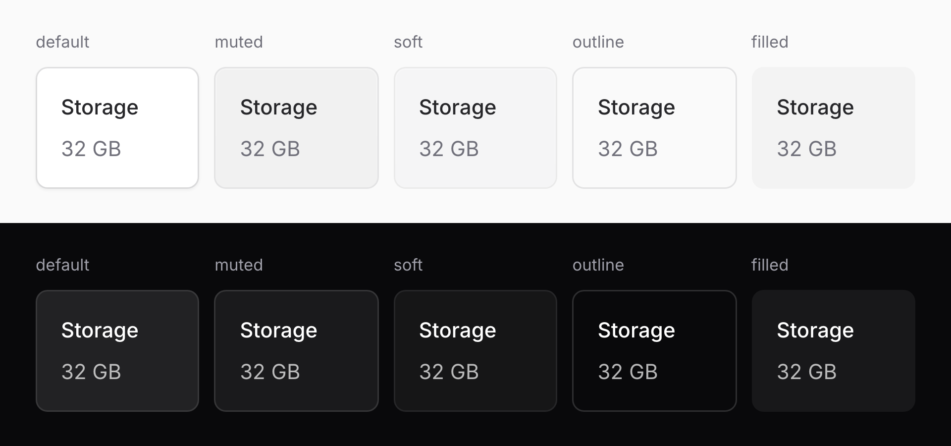 The `variant` prop gives you five surfaces. The default has a shadow in light mode and elevation in dark mode, while `outline` keeps the border without either. `muted` and `soft` offer quieter tints, and `filled` drops the border entirely. The tints adapt to the background underneath, with colors tuned for light and dark mode. Mix them freely without losing consistency.
## Body treatments
The `variant` prop gives you five surfaces. The default has a shadow in light mode and elevation in dark mode, while `outline` keeps the border without either. `muted` and `soft` offer quieter tints, and `filled` drops the border entirely. The tints adapt to the background underneath, with colors tuned for light and dark mode. Mix them freely without losing consistency.
## Body treatments
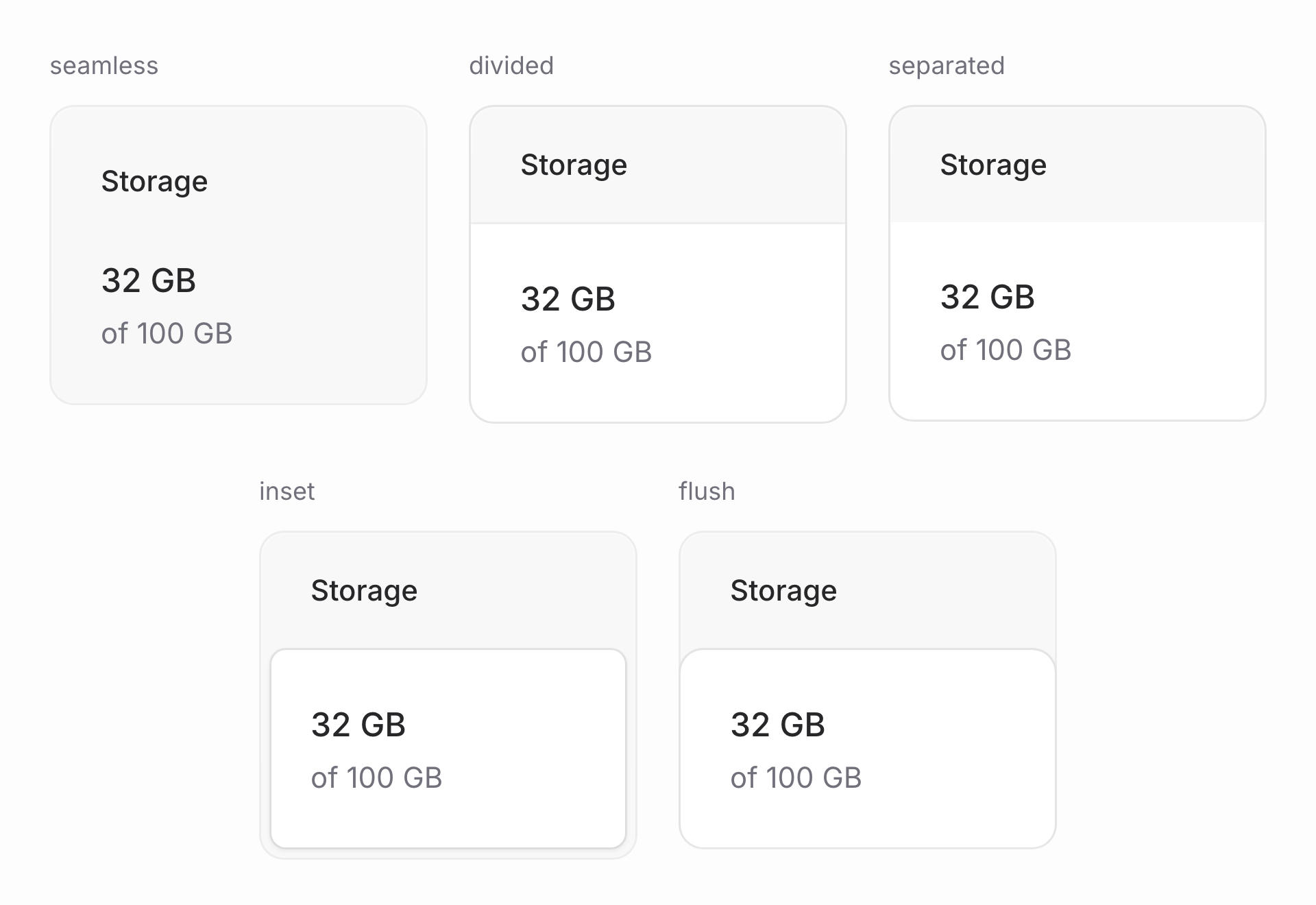 The `body` prop changes how the parts meet. `seamless` keeps everything on one surface, `divided` adds lines, `separated` adds tinted bands, and `inset` or `flush` gives the body its own panel.
Each treatment has its own spacing for a reason. With no boundaries between parts, seamless cards can sit tighter. Dividers and panels need more room so nothing feels crammed.
## Headers and corners
The `body` prop changes how the parts meet. `seamless` keeps everything on one surface, `divided` adds lines, `separated` adds tinted bands, and `inset` or `flush` gives the body its own panel.
Each treatment has its own spacing for a reason. With no boundaries between parts, seamless cards can sit tighter. Dividers and panels need more room so nothing feels crammed.
## Headers and corners
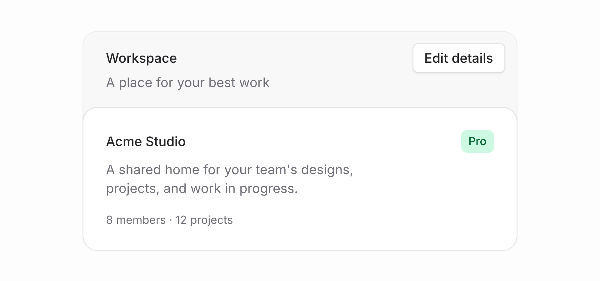 Small buttons in `flux:card.actions` hang into the header's padding, with equal space from the top and side edges. Their labels line up with the heading text without making the header taller. Bigger controls get the space they need, and actions placed before the heading move to the leading side.
Look at the profile card in the hero: its body is inset, with corners rounded concentrically to the card's, so the gap between the curves stays even all the way around.
Headers and footers also work on their own outside a card, or as sub-sections nested inside a body.
## Sizes
Card comes in four sizes: `xs`, `sm`, `md`, and `lg`. Each has individually tuned padding, typography, corners, and gaps, from compact sidebar cards to roomy settings forms.
## Bleed
Small buttons in `flux:card.actions` hang into the header's padding, with equal space from the top and side edges. Their labels line up with the heading text without making the header taller. Bigger controls get the space they need, and actions placed before the heading move to the leading side.
Look at the profile card in the hero: its body is inset, with corners rounded concentrically to the card's, so the gap between the curves stays even all the way around.
Headers and footers also work on their own outside a card, or as sub-sections nested inside a body.
## Sizes
Card comes in four sizes: `xs`, `sm`, `md`, and `lg`. Each has individually tuned padding, typography, corners, and gaps, from compact sidebar cards to roomy settings forms.
## Bleed
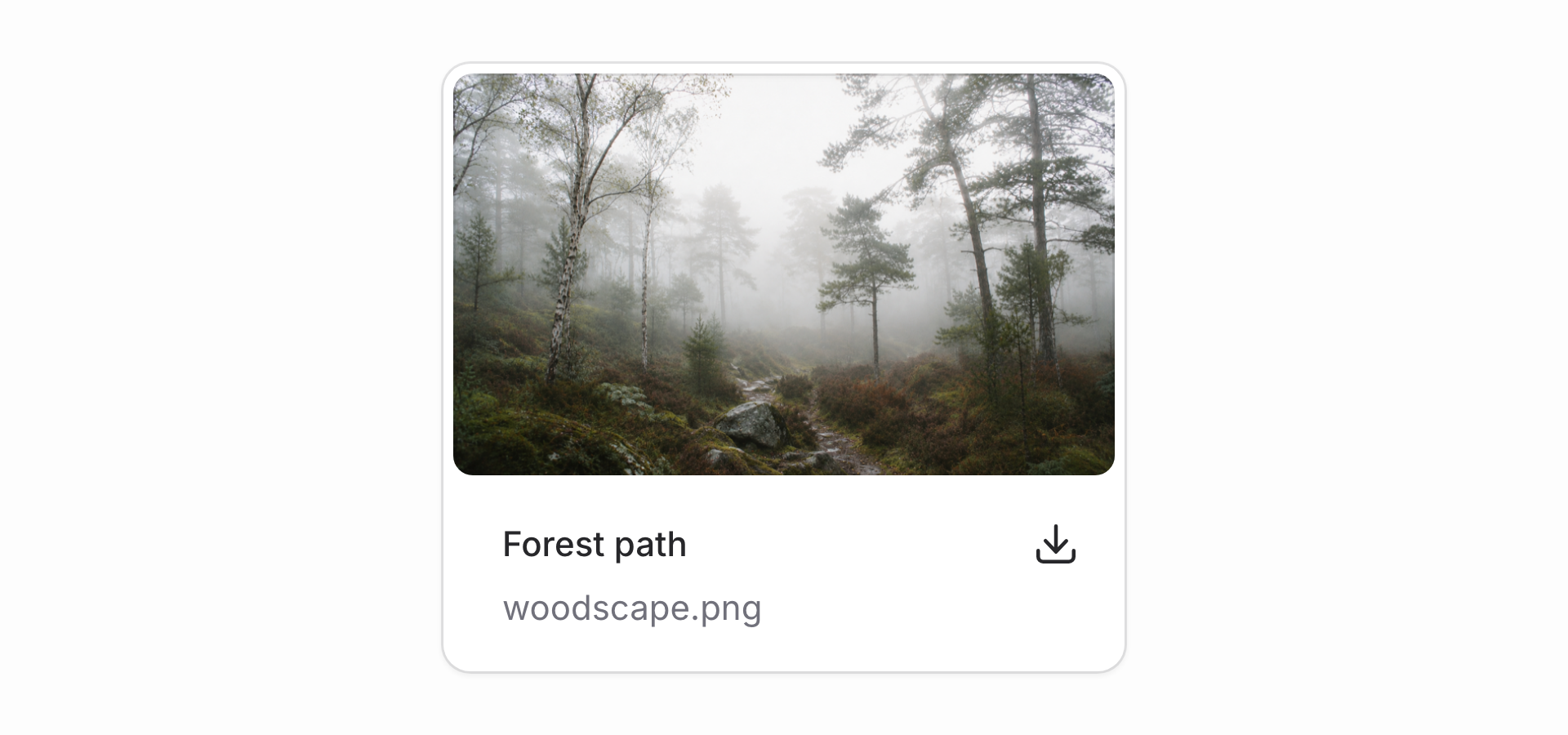 Let images fill the body, right up to its rounded edges, while the footer keeps its own padding and room for actions. Wrap the image in `flux:card.bleed` and the card handles the fit. Tables have a `bleed` prop too: rows run edge to edge while their content stays aligned with the rest of the card.
We tuned every size, color, border, and line of text by hand, across each surface and body treatment. And since every card is built from the same few parts, your design holds together whether you're writing the markup yourself or an LLM is generating it. All those little decisions are now yours to reuse. 👌
Card is part of free Flux.
[Check out the card docs →](https://fluxui.dev/components/card)
Let images fill the body, right up to its rounded edges, while the footer keeps its own padding and room for actions. Wrap the image in `flux:card.bleed` and the card handles the fit. Tables have a `bleed` prop too: rows run edge to edge while their content stays aligned with the rest of the card.
We tuned every size, color, border, and line of text by hand, across each surface and body treatment. And since every card is built from the same few parts, your design holds together whether you're writing the markup yourself or an LLM is generating it. All those little decisions are now yours to reuse. 👌
Card is part of free Flux.
[Check out the card docs →](https://fluxui.dev/components/card)