# Avatars
Published: March 25, 2025
Version: ^2.1.0
We've added a new Avatar component to Flux UI. It's a small, but important, piece of UI that we held off on until we could give it the attention it deserves. Let's take a look.
Adding an avatar to your app is straightforward:
```blade
```
## Fallbacks
Not everyone has a profile picture, so we wanted to make sure the alternatives still look good.
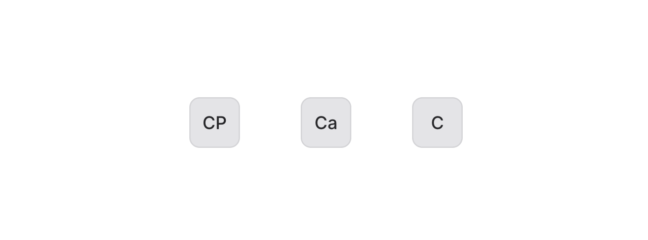 When no image is provided, the avatar component will use the name to generate initials:
```blade
```
## Colors
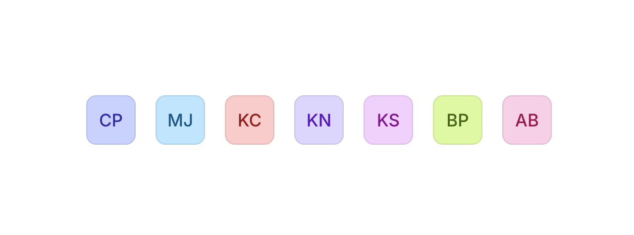
We added some sensible color options, including an auto-color feature that gives users a consistent identity.
When no image is provided, the avatar component will use the name to generate initials:
```blade
```
## Colors
We added some sensible color options, including an auto-color feature that gives users a consistent identity.
 ```blade
```
The `color="auto"` option creates a color based on the name, so the same user gets the same color consistently. A small detail that helps with visual recognition.
## Badges
```blade
```
The `color="auto"` option creates a color based on the name, so the same user gets the same color consistently. A small detail that helps with visual recognition.
## Badges
 Add status indicators or notifications:
```blade
Add status indicators or notifications:
```blade
 ```
## Groups
```
## Groups
 Group avatars together to save on horizontal space when needed:
```blade
3+
```
Or use them in tables, dropdowns, and other UI elements:
Check out the [Avatar documentation](https://fluxui.dev/components/avatar) for more examples and detailed API reference.
Group avatars together to save on horizontal space when needed:
```blade
3+
```
Or use them in tables, dropdowns, and other UI elements:
Check out the [Avatar documentation](https://fluxui.dev/components/avatar) for more examples and detailed API reference.