The Changelog
What's new around here?
Succinct and informative updates about Flux.
November 26, 2025
Kanban
Version ^2.9.0
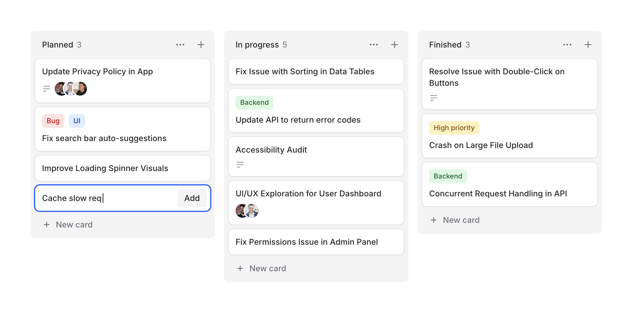
Project management, task tracking, workflow visualization—kanban boards are everywhere. Designing them from scratch can be tedious, so we figured Flux should make it easy.
Cheeck out our new Kanban system, a collection of components for building beautiful workflow boards. Take a look.
Copy to clipboard
<flux:kanban> @foreach ($columns as $column) <flux:kanban.column> <flux:kanban.column.header :heading="$column->title" :count="count($column->cards)" /> <flux:kanban.column.cards> @foreach ($column->cards as $card) <flux:kanban.card :heading="$card->title" /> @endforeach </flux:kanban.column.cards> </flux:kanban.column> @endforeach</flux:kanban>Column arrangements
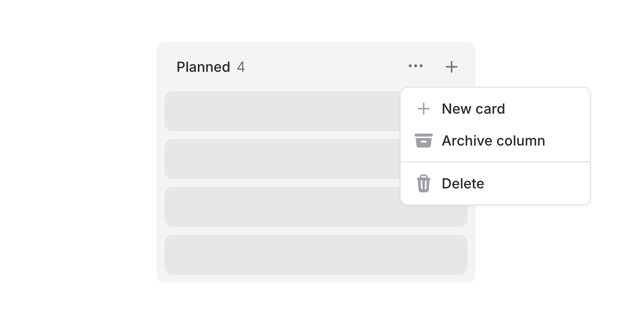
Columns support headings, counts, and action slots. Add dropdowns for column management or quick-add buttons:
Copy to clipboard
<flux:kanban.column.header heading="In Progress" count="5"> <x-slot name="actions"> <flux:dropdown> <flux:button variant="subtle" icon="ellipsis-horizontal" size="sm" /> <flux:menu> <flux:menu.item icon="plus">New card</flux:menu.item> <!-- ... --> </flux:menu> </flux:dropdown> <flux:button variant="subtle" icon="plus" size="sm" /> </x-slot></flux:kanban.column.header>Flexible cards
Cards are composable with header and footer slots for maximum flexibility.
Card headers
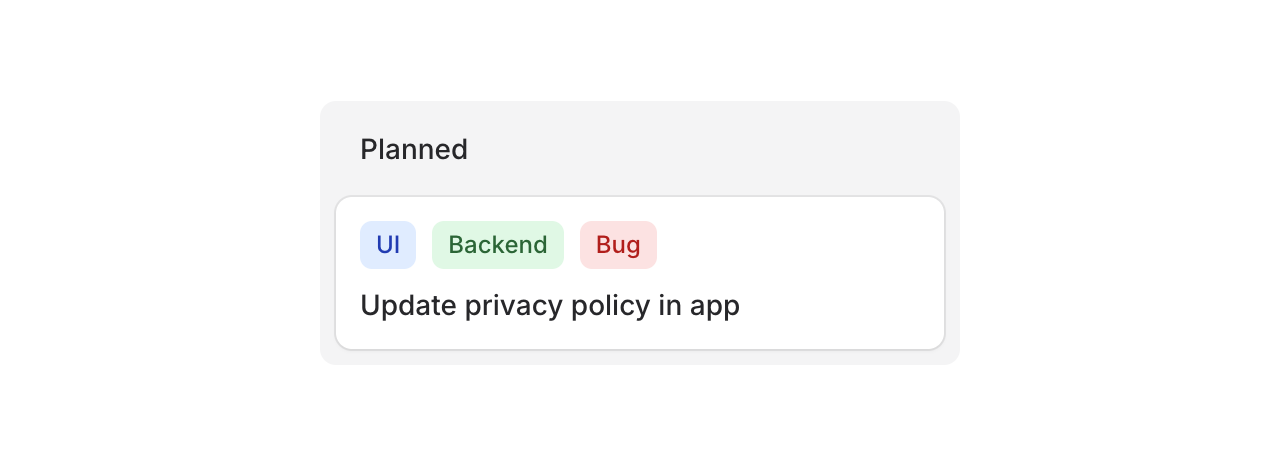
Use the header slot for badges, tags, or labels:
Copy to clipboard
<flux:kanban.card heading="Update privacy policy"> <x-slot name="header"> <div class="flex gap-2"> <flux:badge color="blue" size="sm">UI</flux:badge> <flux:badge color="green" size="sm">Backend</flux:badge> <flux:badge color="red" size="sm">Bug</flux:badge> </div> </x-slot></flux:kanban.card>Card footers
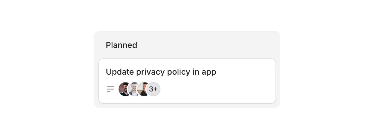
Use the footer slot for avatars, icons, or metadata:
Copy to clipboard
<flux:kanban.card heading="Update privacy policy"> <x-slot name="footer"> <flux:icon name="bars-3-bottom-left" variant="micro" class="text-zinc-400" /> <flux:avatar.group> <flux:avatar circle size="xs" src="..." /> <!-- ... --> </flux:avatar.group> </x-slot></flux:kanban.card>Cards can also be made clickable with as="button" to open modals or detail views:
Copy to clipboard
<flux:kanban.card as="button" wire:click="edit({{ $card->id }})" heading="{{ $card->title }}"> <!-- ... --></flux:kanban.card>Drag & drop
Flux doesn't ship with drag-and-drop features, but you can add them using Alpine's x-sort plugin or preferably wire:sort in Livewire 4 (currently in beta):
Copy to clipboard
<flux:kanban wire:sort="moveColumn"> @foreach ($columns as $column) <flux:kanban.column :wire:key="$column->id" :wire:sort:item="$column->id" > <flux:kanban.column.header :heading="$column->title" :count="count($column->cards)" /> <flux:kanban.column.cards wire:sort="moveCards"> @foreach ($column->cards as $card) <flux:kanban.card :heading="$card->title" :wire:key="$card->id" :wire:sort:item="$card->id" /> @endforeach </flux:kanban.column.cards> </flux:kanban.column> @endforeach</flux:kanban>Check out the Kanban documentation for more examples and the full API reference.